Is This The Most Elegant Map Ever?
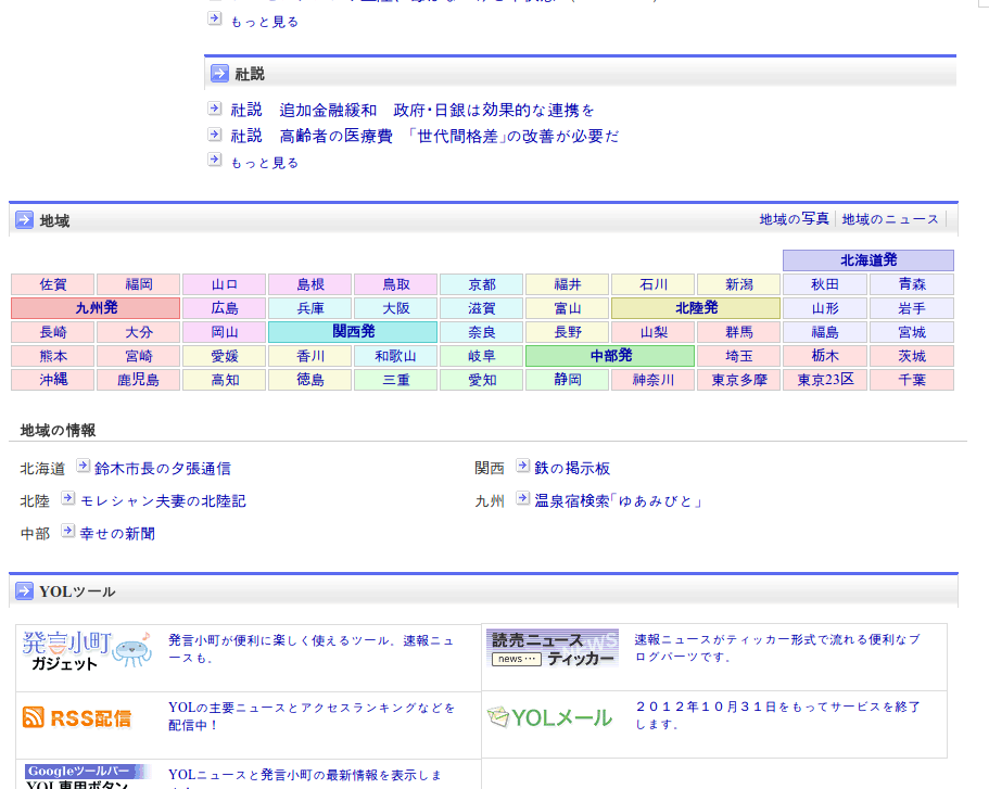
I was having a look at the state of Japanese web design today (we’re doing some customer research there at the moment) and saw this towards the bottom of the home page of the Yomiuri Shinbun site.
For those who don’t know, the Yomiuri is the world’s largest newspaper by circulation. I would imagine their website is also read by Japanese from a wide variety of demographics.
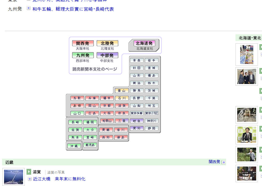
At first glance, the object looks like an oddly-arranged table of news stories by region. A couple of seconds later, I realised it wasn’t a table but an extremely abstracted map of Japan configured to fit neatly across the page. They have a somewhat less abstracted vertically-orientated version here.
Perhaps most surprising about this is that (I assume) readers would understand that it is a map. They can then effortlessly locate the region on it that they are interested in. The form of the graphic facilitates the acquisition of the data perfectly for the context it’s in (and assuming you know your map of Japan). Note its economy of space, the use of colour for the super-regions, and the sheer elegance of this solution for a script (kanji) that doesn’t have a logical ordering of it own.
This, surely, is information visualisation nirvana – and it’s in the wild, being understood by people who aren’t design geeks like me.
(I also found a few other, less abstracted but still interesting, examples from other sites with a brief Googling)
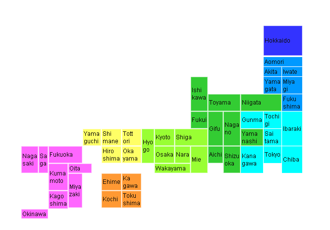
I also like its unembellished visual economy. A little reminiscent of the periodic table, also a masterpiece of design. Trying to remember where else I’ve seen this sort of thing.
It looks like it may have been implemented using an HTML table, which, while lightweight in markup terms, would of course be an abuse of the element, and not very accessible in a screen reader or text-only browser. And of course it wouldn’t translate very well to English or other writing systems not as compact as Kanji.
Yes – the HTML issue is notable, but the map’s existence is mainly because Kanji do not have a natural order. Other languages would just use an ordered list in a similar context. Translation is therefore a moot point I think. Would be interesting to find out if, say, inhabitants of the British Isles would recognise a similarly abstracted map of the UK though – I somehow doubt it.
It also helps to have a long thin rectangular ish shaped country.
Japan’s more vertical than it is horizontal though. But hey, Fidel! We have an idea for Cuba!