Getting Users to Complain
As luck would have it, my Internet connection went down yesterday. That’s not exactly a disaster because the only thing I could muster for World Usability Day (yesterday) was this:
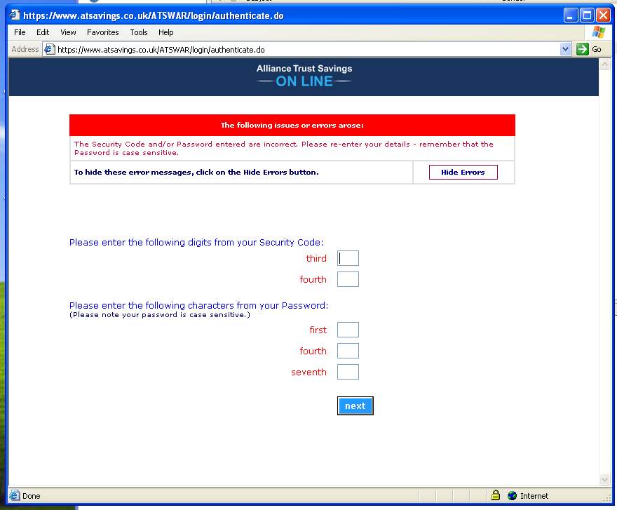
This is the password input screen for my online SIPP account. Part of me is glad it looks cheap, because it confirms that I’m not paying them to pay someone like me to design a fancy system. That said, I thought it was sufficiently novel example of a usecrime in progress to warrant a blog note.
I get my password wrong, and after the customary blurb, it then says:
“To hide these error messages, click on the Hide Errors button.”
This is an interesting innovation in forms design. Firstly, WHY would you want to hide the error messages (“these errors”)? If I click on the button to hide them, and get my password wrong again, does it mean that I won’t see any more errors? In fact, clicking the button does exactly what it says. It makes the error message (and the button) go away and nothing else is affected. I can then put my password in again as if nothing had happened. But what possible value is there is being able to hide the message first?
This goes to the heart of the whole “value in IA” debate. The user can’t do anything else on this screen apart from close the window or get the password wrong again, neither of which is catastrophic. So who cares about some weird thing about dismissing error messages?
The answer of course is that non-sensical, non-standard behaviour, no matter how easy it is for the user to recover afterwards, has a cumulatively negative effect. It sows the seeds of doubt: if they get this wrong, what else is going wrong that I *can’t* see? It frustrates: maybe it’s me getting it wrong, maybe it’s them, how do I know if this is significant? The cumulative effect of all this mental noise corrodes the experience of using the system (which in this case is depressingly clunky after you log in as well).
I wonder if the directors or shareholders of this company have ever used this system? If they have, they probably shrugged off the “hide error message” button as just some web flotsam. A bit like the “mono” button on an amplifier perhaps, or the “scroll lock” key on their keyboard. In any case, the problem is for users to recognise bad usability for what it is. Being confused by an interface, or worried about what to do with one, should be worth complaining about.
So it occurs to me that the organisers of World Usability Day have missed a trick. What we need is a campaign aimed at encouraging users to complain about bad usability. Make people confident enough to recognise it as being something they need to complain about – like potholes in the road, bad smells, or noisy neighbours.