I worked for the UX department at Sainsbury’s between 2020-2024, and was peripherally involved in the evolution of their design system over that time. While I was there, I wrote the following document (which I have abridged here).
Category: User Experience
As a designer, using Notion is a great opportunity to critique a complex interface. Yes, it’s unfair on the XDs at Notion (if indeed there are any, and I have my doubts…) for all the reasons that I’d hate some outsider dumping on my stuff without them knowing the constraints I was under. But it’s…
The latest versions of Chrome have been showing a “dial” icon for a while, accompanied by a completely unnecessary corruption of the favicons in the tabs: Hover over it, and a tool tip says “Tab active again“. You can only see the icon (and thereby read that message) by clicking on the tab. And that…
There’s a belief close to dogma in UX design and product management: that examining data will reveal something that will improve the UX or the product in some way. Some even refuse to do any design until they have done “research” or have access to web analytics, customer feedback, or some such. There is nothing…
I am suspicious of designers who use the first person in the explanations of their designs. Why should we care what they personally like or want? What makes their opinion any better than anyone else’s? Those who state an idea about a design on the basis of even a handful of data points, a thought…
A recent conversation I had about UX research centred on whether such research is to help designers predict eventual outcomes of design interventions, or whether its role is to “de-risk” UX or business ideas. They were keen to frame research as a way of lowering risk to the business. This applied both to design validation…
Over the last couple of years, I’ve been helping out with our corporate blog, a Medium publication. Medium is utterly awful for the purpose of corporate blogging. Disclaimer: Some of the things described here are so molar-crushingly bad that I suspect they are in fact not true. Perhaps it’s the lack of any detailed documentation…
On my LinkedIn profile, I say the following: I predict the future. Not flying cars or robot pets, but whether any given design intervention will raise, lower or have no effect on your KPI. I do this through researched hypotheses and experimentation to become progressively less wrong. By understanding people’s behaviour and what motivates them…
It’s unfortunately true that whenever you research a list of “pain points” from customer feedback, those pain points will mysteriously turn out to be mostly – if not entirely – previously known to the business. And they’ve probably known about them for a surprisingly long time. That sound you hear is the researchers’ crests falling…
Apropos of nothing much, I was reading this rather controversial bit of research from Baymard today. It’s pretty good, as most Baymard pieces are (although why should I care what percentage of sites do what?), and it contains this example of what it says is bad practice:
The use of “toggle” switch UI in place of check boxes has been growing in popularity over recent years, and is approaching a convention in some contexts (particularly mobile). But there is a problem with them that designers should bear in mind:
What is design? How do we make the most of research? These are two questions that seem at first unrelated, but are in fact strongly connected. The following thoughts came from trying to make sure research activity is used, appreciated, and understood. Along the way, it revealed an approach to design that may help solve…
I see that Matt Edgar, Head of Design at the NHS, has announced the withdrawal of the NHS Common User Interface (CUI). The reason given is that the CUI had not “changed with the times” following the closure of NHS Connecting for Health in 2013.
It seems sensible to say that not involving engineers early on in the project discovery process is risky. And at the very least it’s demoralising for the engineers. The primary advantage of getting engineers involved at the start is seen as lowering risk by allowing them to advise on feasibility, make early decisions about the…
Ever since Amazon removed their navigation from their checkout screen, it has been said that transactions (or other critical tasks the business would prefer the customer to complete) should not have “distracting” navigational elements on the screen. This is because those elements could take people away from the task at hand and erode conversion. Not…
The state of copy writing on most websites appears to me mostly to be good in terms of tone, but rubbish in terms of length and structure. I also notice that just about all “style guides” for tone of voice don’t address this issue either. It’s not very hard to explain the concept of precis,…
Why is it that so far no web application platform, framework or content management “solution” seems to care about the UX of the applications they are responsible for creating? Systems such as React, node.js, Zend, Drupal, Rails, etc. allow for the debugging of code, the optimisation of resources, ease of configuration and deployment. But they…
The reasons why confirmation dialogues are inferior to “undo” (perhaps better termed “delayed triggering”) are pretty clear, well understood, and accepted by anyone who has taken the time to read something about HCI. Undo has also featured in usability heuristics since time immemorial.
While reviewing a site last week, I noticed the following behaviour in a faceted search UI: Search for something as free text (eg “cups”); get a big list of cups and related items. Use filters to narrow down the list by selecting a search facet (eg “plastic”) Select another facet (eg “colour”). I then see there is no…
At the trainspotting end of the UX spectrum of activity lie articles like this, from Information Architects Inc., which for some reason I find myself reading. While IA’s article is far too long and badly needs editing, the following occurs to me:
Having re-designed the UI for MailOnline’s content publishing systems (currently producing close to 1,000 stories daily), my work there is now done. I’ve always been interested in how organisations work, and it was a great experience doing UX at the world’s biggest news site. I worked daily with journalists and editors of all kinds to understand how…
In a further instalment of Google-bashing, here’s something that’s been bothering me for a while about Google Contacts on Android:
I’ve been using Gmail for years, yet I still sometimes have to think quite hard about which menu to use for lesser-used things. While I can see the logic in having a “More” menu where such things can go, I can’t understand why they can’t just all go in there. Why is an additional menu needed, and with…
This is a sensitive topic: I’m often aware that comments I make on blogs aren’t published if they contradict the point the blogger is making. Usually I just let it go. It’s their blog, they can choose to defend their opinions or not. But sometimes I think it’s worth publishing my thoughts here if they don’t…
Designing and building software is at least as complex and demanding of intellectual labour as the building of ships, large buildings or suspension bridges. If the number of failed software projects is anything to go by, perhaps it’s is even more difficult than these. In modern history at least, the underlying assumption when performing complex…
I feel the need for some cathartic adjustment of one of the more annoying interfaces I have to look at most days: the Outlook Meeting Invitation. Outlook’s current offering is full of annoyingly confusing clutter. So here – more for my benefit than yours – is my re-take. The current UI is mostly irrelevant noise:
Appprops of the work I’m doing on the MailOnline CMS, I think the following is a thing. And I’m going to call it a theory: The probability of reading a warning dialogue decreases by the square of the number of other warning dialogues you have seen before in that session.
A few months ago, the New York Times wrote about “Scoop”, their new publishing system. Scoop, they point out, is more than just a means of facilitating their editorial processes. They see it as “…central to our ambitions to innovate on all platforms”. They also point out that the capabilities, ease of use, and competitive edge of content management systems is an…
I was interested to read this article the other day about using web analytics. While pretty inconclusive (it’s a PR piece after all), it got me thinking. Are web analytics useful in UX design?
I often complain that infoviz for web stats is poor if you’re not an analyst by trade. Now that I’m working for one of the most popular websites in the world, I should at least come up with a device that could be used to answer the fundamental questions we have when looking at real-time…
This is a condensed version of my talk for the Bulgaria Web Summit, 31st May 2014. I spoke without real notes so the following is simply the main points. Introduction How should a UX team respond to the results of randomised control trials of their designs? Such “A/B” and “multivariate” tests hold out the possibility of…
Gosh, WordPress 3.9 sure broke a lot of things on my blog so I’ve had to replace the theme and disable a few plugins. This is test post.
(This post implements my new year’s resolution of sub-titling my sections so as to make me look like I know what I’m talking about.) At MailOnline, we have no development process. Well, that’s not entirely true, we use Programmer Anarchy. The developers decide for themselves which “table” they want to work on, and can then…
The story – now passed into minor Internet legend – of Marissa Mayer’s testing of 41 shades of blue in 2009 (and the resignation of Google’s Visual Design Lead, partially because of this) has been referred to again this week. The Guardian reports that Google UK’s managing director Dan Cobley says that the winning shade…
Sometimes, what seems the obvious way of dealing with a problem may not be the best solution. For example, it turns out that if you remove traffic controls from busy city centres and rely on peoples’ instinct for self-preservation, you may get better road safety than if you imposed traditional control interventions (see also “shared…
Harry Brignull’s “Dark Pattern Library” pops up from time to time on various news feeds (today on Business Insider, for their mutual SEO benefit). We hired Harry when I was at Hotels.com to do some customer research work in 2009. I recall we got along OK. The fact that he later included us in his…
The question of “fat finger” mistakes on touch screens came up in conversation the other day, together with the idea of making targets large to avoid this. At first, it seems sensible to make hit areas for controls on mobile devices as large as possible. But it was pointed out that, counter-intuitively, smaller hit areas…
When multiple designers work on multiple assets or across multiple projects, it gets very difficult to manage files over time. Which files are the latest versions? Which files are even relevant any more? Which files contain things that may be affected by the contents of other files? Yet with a few short-term exceptions, I have yet…
There’s some debate about the utility of “high-fidelity wireframes” at work at the moment. It’s a reasonably common topic in the UX chattersphere too, so I thought I’d expand on it here. Firstly, to avoid some potential misunderstandings – let’s make some assumptions about the domain we’re in:
Now that Google has released Glass to external developers, it’s approaching the point where if you work anywhere near information technology, you are going to need some kind of opinion about whether Glass will be the mass-market success Google wants it to be. Glass deserves a fair assessment, if only because Google has the software muscle and…
After a little over 5 years at Hotels.com, part of the Expedia Inc. group, I shall be moving on to be Lead UX at MailOnline, part of A&N Media. It’s not actually the Daily Mail, but it is publishing, it is advertising funded, and as such it’s at the centre of one of the most…
I dislike pie charts. I may even dislike people who use them. But even worse than a pie chart is a quite recent device that doesn’t (I don’t think) have a name. These are the circles that appear mostly in newspapers and magazines to illustrate some quantitative comparison – here’s an example of what I mean. This technique…
I’ve been lurking, and recently posting, on Edd Dumbill‘s Google+ “community” discussion about “big data” since he set it up a few weeks ago (dunno if it’s a public group – G+ is opaque about these things – and I’m too lazy to find out). Dumbill works for O’Reilly Media, and helped popularise the term “big…
I was having a look at the state of Japanese web design today (we’re doing some customer research there at the moment) and saw this towards the bottom of the home page of the Yomiuri Shinbun site. For those who don’t know, the Yomiuri is the world’s largest newspaper by circulation. I would imagine their website is also read…
Until iOS came along on Apple’s touch screen devices, having a windowing operating system was de rigour for any sophisticated computing experience. Nobody really asked why – it just seemed good. Have a video playing in one window, your email in another, have your spreadsheet in another one and, I dunno, move them all around…
I was having a look today at this question posted on Quora: “What are the most unexpected things people have learned from A/B tests?“. The writer clearly expects answers on specific tests, but a couple of people have referred to the surprising behaviour of people who run or react to the tests themselves. I think…
How about that for a boring title? But it’s something that bothers me quite regularly. Why is it that “asymmetric encryption” appears to be fundamentally beyond the understanding of anyone who doesn’t work directly with computers? It’s now become such an issue for me that I’ve written to my MP about it. But before you…
I’ve been using Ubuntu Precise Pangolin’s HUD feature, which is now included with Ubuntu’s Unity desktop. You may recall I went a little crazy about this feature when it came out of beta. So after a few months of using it, what are my experiences? Firstly, it’s clear that the HUD needs a speedy machine.…
A recent post on 37Signals’s blog is interesting. Jason wants somebody to help them with customer conversion and retention. One of the reasons why I like 37Signals is that they truly subscribe to the model laid out by the Cluetrain Mainfesto. 37Signals have without doubt turned their organisation “inside out”, as the Manifesto predicts modern…
Yes! Break out the bubbly and scream! The first actual innovation in WIMP interface design since about 1985 has finally made it into the mainstream! As of this week, Ubuntu 12.04 LTS (Precise Pangolin) is shipping to desktops with the HUD!!
At hotels.com we’re pretty test-driven. We’re testing stuff all the time on the site with multi-variate or A/B tests of various kinds. But as I always point out, doing tests (or indeed any kind of quantitative or qualitative research) is easy. It’s what you do with the results that count. So when I see a…
It seems like not too long ago, many IA/UX designers fought endless battles on mailing lists and Usenet about whether Visio was better than Freehand which was better than Omnigraffle which was better than Excel (no, really, I’ve seen people use Excel to express UI ideas). There was always some software or other that totally…
(If you’ve come to this from Twitter, I’m just testing my new Twitter WP plugin with this article) Shortly after I wrote up some thoughts on test-driven UX, I happened to notice “Bridging User Research into Design” over on UX Matters. In the article, 11 of the great and the good offer their thoughts on…
At Hotels.com we’ve been doing multi-variate testing (“MVT”, or sometimes “A/B testing” if you’re variant challenged) for a while. This means we typically build a number of different designs, then let them duke it out on the live site to see which one performs the best. Recently, however, I’ve been increasingly aware that while we…
Quantitative research and design make uneasy bedfellows at the best of times, but a recent Microsoft blog post shows just how uneasy this relationship can become. Trying to do design for a massive corporation in which design comes a distant third behind the business model and engineering is plainly maddening.
Robert Scoble has an interesting interview with Chandu Thota about The Dealmap (recently bought by Google). Although I completely take Thota’s point about APIs and 3rd parties, what strikes me is the apparently automatic assumption that using a map (and the now nearly ubiquitous Google API mashup) is the best way to show his data.…
To what extent should a designer specialise? Can somebody perform UX/IA design as well as graphic design as well as the craft of markup and styling? And does that increase their effectiveness? Is it in fact only possibly to span two of these areas? And what does “effectiveness” mean in this context? That last question…
If you put something up on the web, you need to give it a date stamp. Not doing so makes you look like Squidoo. So I’m shocked (no, actually, I am quite surprised!) that parliament.uk thinks it’s acceptable to leave them off. Maybe it means they just don’t care about things like accuracy. I guess…
I see that Stephen Few has now encountered the work of David McCandless and, as I expected, has rather a lot to say about how bad it is. He’s not alone in thinking that McCandless’s work as minimally informative, often unclear, and sometimes downright misleading. Like Few, I have yet to see McCandless create an…
It’s not often you get a radical change in the WIMP model, but the mighty Christian Giordano has tried just that with the introduction of “overlay scrollbars” in Ubuntu 11.04. Unfortunately, I think this is what might be called a “misfire”. The main problem is that in hiding the thumb of the scroll bar by…
Agile development is a process (nay, a “culture”) that amongst other things has a number of revolutionist slogans attached to it. One of these is “fail fast” – sometimes boosted by the rejoinder “fail often”. My relationship with Agile has been a bumpy one, but I think I’m qualified to at least understand the basics…
Saying that hoards of my friends like Wired’s website is just a lie. Or at least implying that they do is disingenuous as I’m pretty sure that none of them have liked it. And is that huge number just made up? Who cares? This sort of casual fakery (which Facebook thinks nothing of, regardless of…
It has become a shibboleth of the UX and Agile communities that “collaborative design” is the best way of designing things. Or if not the best way, it is at least better than leaving people to come up with solutions on their own. Regular readers of Webtorque will know that if there’s one thing I…
I’ve been wondering whether using Chernoff faces might be a good variation of the “advanced search” pattern in the context of finding a hotel to stay in. Choosing the right hotel requires a number of quite complicated things to be considered. But which things you place the most emphasis on depends very much on the…
I’ve had a bit of a realisation about the way I come up with design ideas that I’d not considered before (see below), but first, an important aside. Many people in my field mistake the activity of discovering and refining their own design processes as being a signal that they should recommend these processes noisily…
Several months ago, we made some changes to the search results of hotels.com, and among these was the creation of a “pinned header”. As you scroll down through the list of results, a portion of the page header stays with you. Here’s the UI before scrolling. And here it is with the header pinning (linking…
Ah, synchronicity. No, not the 80’s album by The Police, but the fact that I was recently thinking about “back” buttons and software states in the design of our forthcoming Android and iPhone app. And so was Aza Raskin. Raskin suggests an improvement to the much-improvable experience of using the Apple iPhone’s ultra-simple, yet rather…
I think I’ve been a user experience designer for about 10 years now. I say “I think”, because I regularly read descriptions of methods of working and relationships between people in multi-disciplined web and software development teams that I don’t recognise. It is of course with great interest that I like to find out about…
Not that I expect truth in advertising, but this is a nice example of an abuse of statistical graphics. In this case, a bar chart from Debenhams in Oxford Circus. You could be excused for thinking that Debanhams travel services are offering TWICE as many Euro for the same price as you’d get from their…
So I bought a Kindle the other day, and have been thinking whether I should have bought an iPad instead. But the more I use the Kindle, the more that seems like an irrelevant question, despite all the debates that rage around it. For example, somebody I know recently mused that “… in some way…
Last year, our fearless team of interaction designers, creative designers and interface engineers (about 20 of us at the time) took the decision to embrace Scrum, the “agile” methodology for project management. We were all given training courses to attend, and I myself volunteered (along with several others) to become a certified Scrum Master. As…
Lately I’ve been rather depressed about the state of user experience design. Both my own (management overheads, inability to sweat the details, lack of self-belief…) and that of the wider community. So it didn’t help that one Cameron Chapman delivered a further kick in the teeth the other day with 10 Usability Tips Based on…
Ryan Carson is funny :-)
New in Google’s live testing is what Jef Raskin described as “incremental search” (also jokingly referring to the dominant search pattern as “excremental search”) about 10 years ago. He predicted it would be usually the best way to perform free-text queries like this. At the time, few systems were really able to implement it, so…
Examples of good functional design in the digital space (as opposed to good ways of making existing ideas look nicer), are so damn hard to find these days. It follows that good designers are also very rare. So thank heaven for Aza Raskin, scion of the late great Jeff Raskin, designer of Firefox mobile, and…
I admit it, I’m on Facebook. I know they’re selling my information. They probably have a whole team of people called something like “Personal Data Merchandising” thinking up new and ever more devious ways to trick me in to giving away just that little bit more. I sort of know I’ll regret it. A bit…
Every time I decide to pen a rant about some user experience issue or other, I feel a bit guilty. Guilty because I know it’s hard to be positive, easy to be cynical, and makes me look nasty. But I’m going to justify this one on the grounds that if countless hoards of designers are…
David McCandless is an interesting person doing interesting things. Interesting to me, that is, because his work exemplifies something I find deeply mysterious in the way people regard information visualisation. His pursuit of “beauty” seems to be a licence to override clarity, truth, and even common sense. Yet he is widely lauded (here he is…
With the launch of the Apple iPad just days away in the UK, I’ve been reading reviews of the device in the popular press (a typical article here). First let me state that I probably will never buy an iPad unless I’m forced to do so. But one good thing it’s done already is apparently…
It looks like my wife will be stranded in Japan this week following the Icelandic volcano eruption. I thought I’d better look at her travel insurance provider’s website (a company I’d not heard of called Holiday Extras), prior to playing the inevitable game of IVR over the phone. Frankly, I wasn’t holding out much hope…
Here’s a fascinating incident. In a nutshell: net news site readwriteweb.com posts a news article about some Facebook business development with AOL. Nothing remarkable about that. But then something strange starts to happen. Hundreds of people start posting comments complaining about how their beloved Facebook has changed and they can’t log in … to readwriteweb.com.…
Lovemoney.com has a free personal finance dashboard that I thought I’d have a look at. It’s really an early beta, and they’ve been soliciting feedback and generally being very receptive. So, I’ve just sent them the following email. By the way, I’ve decided that OpenOffice Presentation, with which I did the mockup, is rubbish. Apologies…
(Apologies to Mike Elgan for the headline on this one) Those in the UK who want to use Google Power Meter can do so using a wireless doobrie from AlertMe Energy. Nothing wrong with that, but words fail me at the staggeringly bad information visualisation on their site. I hardly know where to begin with…
Robert Clayton Miller‘s 10/GUI desktop multi-touch idea wafted out of the ether towards me last week, and I’ve been giving it some thought after watching the video a few times. 10/GUI is unusual in that Miller describes himself as a graphic designer. Unlike people such as as Jeff Han, he is not approaching the issues…
For no apparent reason, I suddenly remembered Jesse James Garrett’s Visual Vocabulary today, which he promulgated almost 9 years ago this October. I recall at the time that there were a number of people hailing it as the first true user experience documentation standard, and I saw no reason to disagree with them. Yet after…
This has been a pet peeve of mine for a long, long time: if you’re going to put information about something on the web, PUT A DATE ON IT. It’s not hard – it can be automated, fun even. As it is, I have to ignore stuff like this because I don’t know if it…
I’ve just been mailed by a company called Zetetic about their mobile password storage application called Strip. Zetetic are interesting in that they are a small, cutting-edge software development house specialising in RoR and .NET. They appear to be principally a consultancy, but also develop and and sell their own applications. This is very similar…
I remember an English teacher asking us what, in our opinion, was the most useless thing we would have to learn at school. I replied that I thought it was the capital cities of the world. What possible advantage could you have over anything with the knowledge that the capital of Peru is Lima? I…
Regular readers of Webtorque will know that I’ve droned on about tag clouds several times. Here I go again, but this time, it’s final. I promise. It comes of a brief discussion about our opinions about tag clouds at work this week, which was a good opportunity to summarise what I thought about them –…
Quoting a single statistic to support an argument is rarely very impressive, regardless whether the numbers themselves are right or wrong. I would say that most statistics are nothing without context. Context is the air that statistics breathe and the engine which powers them to make a point. Yet far too many people simply pluck…
Peter Morville has put together a list of twenty user experience deliverables with links to relevant resources and examples. This is certainly interesting, and Morville is an interesting cove, not least because he’s been on the scene for so long. However, I can’t help reflecting on the fact that he is a consultant. Seen in…
I’ve blogged before about how I think calendars are to dates what pie charts are to numbers, but recently I’ve been thinking a bit more about this issue. The background to this was a discussion I had several months ago around the pros and cons of using calendars for date range selection, for example in…
Nothing is completely new, it just evolves. So it is with content on the web: the traditional free print model of allowing access to content as a way of getting readers to do something profitable has been transmogrified under the influence of SEO and Google’s all-powerful PageRank algorithms. It now doesn’t matter how good your…
I’ve just sent this to eBay in response to their request for feedback on their new item page design: “You are definitely on the right track with this. For years eBay’s page layouts have been painfully bad. Not just run-of-the-mill poor like Amazon or Buy.com, but wilfully, painfully, awful. While most sites merely ignore user…
Here’s a fun, and quite interesting, post-launch “movie” of the changes made in the new delicious UI. You have to be fairly familiar with the old one to appreciate the differences, of course. Oddest thing I’ve noticed with the new design so far: in common with the old design, they seemed obsessed with limiting the…
In many cases, the design and content of a “home page” – the first page you see when you view a web site from its document root – owes its existence more to tradition than sense. Perhaps a home page speaks to the idea of a “cover” in the same way as a cover for…
One thing that bothers me about “design patterns” is that they don’t always seem to be the best method of solving a design problem. In many cases, patterns are patterns simply because they are popular. This of course is a phenomenon not limited to design (music, for example, is another case in point). However, it…
What a beautiful mess. Your mission is to work out how to unsubscribe from one of the mailing lists in the “Newsletter Subscription” section. A lot of work went in to avoiding having check boxes in this design.
I have a 12 month subscription to Britannica Online. This was advertised as a way of letting me link to full Britannica articles free of charge from my blog, should I so wish. Indeed, have a read of this entry, which you would not have been able to see unless you had been a subscriber…
At last, people are openly acknowledging that persona development, or at least the dogma that comes with it, is weird. I’ve been rude about Alan Cooper before, but this is another chance to stick the boot in. I blame Cooper for coming up with the wonderful idea of personas. They’re great for summarising research. They…
Yahoo! has a “dashboard” to let you track the progress of the various candidates in the US presidential race (at http://news.yahoo.com/election/2008/dashboard). Since I’m currently working on a dashboard myself, I thought I’d have a go at improving it from the point of view of information design.
Only just discovered Vimeo.com. I like the overall design very much. It’s pushing the the stereotypical “web 2.0” conventions on rather well: desaturated colours, rounded corners, etc., but it’s very well thought out – everything is there for a reason. I also note some interesting things going on: no scroll bars (just up/down arrows), no…
I was in Spain last week, on the Vodafone ES network, and dialled a wrongly-constructed number. The call didn’t connect (just went dead, no ringing) and I got this message. That number at the bottom is the number I was calling, properly formatted. If the system knows how to format the number – why not…
Eric Reiss mentioned that at conferences in the States you have pre-conference workshops, whereas in Europe you just have lots of drinking. At the start of Day Two of Euro IA – I’m feeling rather sleepy after the cumulative effects of the the pre-conference party, and all the tappas last night. Hope I can hold…
I was thinking about how much I like using OpenID. I’m registered with myopenid.com, who could do with ironing out some kinks in their user experience, but it’s good enough. One thing struck me after reading Tomas Baekdal’s excellent blog post on the subject of privacy policies. I summarised this in my comment on his…
I submitted an idea for a talk at this year’s Euro IA in Barcelona a few weeks ago (just met the deadline). The anonymous review process has now taken place and the results are out: they’d like me to do it as a poster. While I would have preferred a talk to be able to…
I’m not obsessed with tag clouds, really I’m not, but I think they are the single most useful, yet criminally misunderstood and mis-applied UI device out there. I’ve written about tag clouds before, but this time I’m turning up the heat. Controversy time: writing about “best practice” for tag clouds in terms of what fonts…
Here’s an idea for a Euro IA submission I was thinking about (eh Barcelooona!) to fulfil one of my annual HR objectives: the one that says I need to ramp up my public profile to attain the status of European Experience Emperor. Some prodding about seems to indicate that people do see this as a…
From time to time it’s fun to think things through using the “what/how analysis.” This can be summarised by the statement “One man’s ‘what?’ is another man’s ‘how?’” and it can be applied to lots of things in order to work out where you are in a set of processes and how, or whether, some…
Originally uploaded by Gilgongo. I don’t often travel on the tubes, but this must confuse the hell out of tourists! I wonder why they did it like this? Seems to be the case all along the line – well, as far as Camden anyway I think.
Just posted this to Sig-IA in reply to somebody wanting some examples of good tag clouds (see also my earlier venture). I’m sure the following will be wonderfully arcane in about 10 years time. I was looking at movietally.com the other day. While it’s not exactly a shining example of good design overall, the use…
This graphic “explaining” what the BBC’s honeypot might have been employed to do had it been hijacked (which I assume it wasn’t – how boring) is all but pointless. While rather an extreme example, I think it highlights rather well what I’ve realised recently is the biggest single problem I have with graphical representations of…
Originally uploaded by Gilgongo. I’ve been at User Experience 2006 (London). Don Norman looks even more like Capt. Birdseye than normal, but he had some good things to say along with bashing Microsoft and spending rather too long talking about cars. A good day out I think – and one that also might need to…
Microsoft Internet Explorer 6 was released in August 2001. This week, one of the biggest and most damaging private monopolies in human history relented, and fully five years after, we now have their MSIE 7. I installed it today. Coincidentally, a couple of days before I heard that the 7 was out, I happend to…
I’ve become a bit of a tag cloud hawk recently, looking for examples of their use and what I think is abuse, or just plain old misunderstanding. My definition of a useful tag cloud is something that allows you to get a feel for the “mood” of the information tagged on a site. On the…
When designing an e-commerce site, it’s hard to avoid the payment form. For an industry barely a decade old, the payment page has a powerful mystique – associated as it is with high technology like i-frames, fraud, mysterious loss of life savings, and alien invasion. I was thinking about this last week after reviewing some…
I’d hate to be responsible for a website like World Usability Day, but since I’m not – I can’t resist a cheap shot.
I’m sure there’s a wittier subject line for this, but it’s hardly worth the effort. The project I’m currently working on has some “wizzy” interactivity planned, and verges on being a proper “rich Internet application” sometimes. As mentioned here before though, people like me working in the stultifying confines of a web development agency are…
I’ve been keeping half an eye on Slashdot’s tagging beta since they gave me access to it a few months ago. Despite reading the explanation, I’m rather unsure as to where it’s going to go: (Good opportunity for me to try this new image-popping WordPress plugin…)
Golly – it’s about time I wrote down something about user experience design, seeing as this is what this blog is suppose to be about. I’ve been doing some work for a site re-design, starting with user testing 24 people over two weeks. We asked them (a wide demographic) to use some currently live sites…
Alan Cooper: feted genius, father of Visual Basic and giant of user-centred design. Jonathan Baker-Bates: pitiful, microscopic nobody. But at least I’ve designed a few websites…
I assume Alan Cooper hasn’t designed any significant web sites because Cooper Interaction Design only lists one in its case studies, and that is HP Shopping. Cooper (or more likely his acolytes) identified a needs-based persona and presumably designed for that and not any others, as per the methodology handed down by the great man. HP then ditched that design for a solidly features-based Endeca boilerplate a couple of years later. Oddly, the only thing Cooper says about the project in terms of results is that most users would have recommend the site to others. The lack of any reference to sales, or even traffic, speaks volumes to me about Cooper and their work for HP.
Any normal person will of course have heard nothing about the recent merger between LBIcon (business consulting, branding, communication and technology services) with Framfab (web marketing, design and production) into the largest digital design, marcomms, branding and technology firm in Europe. Indeed, the newly-merged entity will rival that of the super giants of Digitas, Omincom and others that currently graze among the lush forests of digital media in the States and Asia. This is surely a tectonic event.
I know the phrase “card sorting” either baffles, bores or does something else beginning with ‘b’ to almost everyone that hears it. Perhaps the most vocal source of information and critique of card sorting techniques recently has been the force that is Maadmob’s Donna Maurer. I recently caught her attention on this subject via comments on the blog of another Australian IA, Leisa Reichelt.
Leisa had been blogging about her negative experience of card sorting in the context of “validating” an information architecture. I’d been thinking about this and the wider issue of whether related techniques might be better or worse, and under which circumstances.
I’ve just posted a rant on www.fool.co.uk about their awful site design. Hm. Feel a bit guilty. A bit soiled to be honest… I actually think the site’s content is fantastic. But the form of that content really, really stinks. The last straw was their announcement of some forthcoming “layout changes” which (I assume) have now gone live. In classic 1995 style, they’ve just made things worse. The site needs major surgery.
I just spend my life specifying stuff. There’s just no time for anything else. Creativity, research, even design (always an afterthought…) is pretty much a covert activity when you’ve got the offshore crews to keep happy. But once in a while I feel I’ve made some headway somewhere, however microscopic.
I’ve always thought that everyone should nurse at least one heresy, and mine is that visual communications of complex ideas are almost always a load of cock. In the field of IA, this is most noticeable in the production of sitemaps, but it can be just as bankrupt for other artefacts as well.
This blog post shows how chaotic the discipline of IA is (see the comments in particular). There’s not even a pretense of union, agreement or even polite tolerance of divergent views amongst the practitioners. I look at designs by other people and I feel almost bound by duty to pepper them with criticism. I even expect it in others: a senior colleague recently reviewed some work I’d done and drew large rings around some elements, writing the words “awful” in large red ink next to them. Two months later, and after much fruitless experiment, the same interaction he so abhorred has now been deployed. The belief that there’s a mythical “true way” promotes the idea that the one who puts their idea across with enough force wins. We’re no worse than cowboy builders or politicians. Oh, and Euro IA rejected my application to give a presentation. Bastards.
For too long, login, registration and online point of sale processes have been designed either by IT business analysts who see users as UML symbols, or worse by developers who don’t want to think about users at all. More often than not, information architects get frozen out. I’ve worked on loads of sites that had ecommerce or registration processes that for some reason were deemed out of our scope for us. So we deliver a great experience up until the point the customer actually wants to engage with the site, whereupon it’s all “enter your 15 digit user name with no spaces or diacritical marks.”
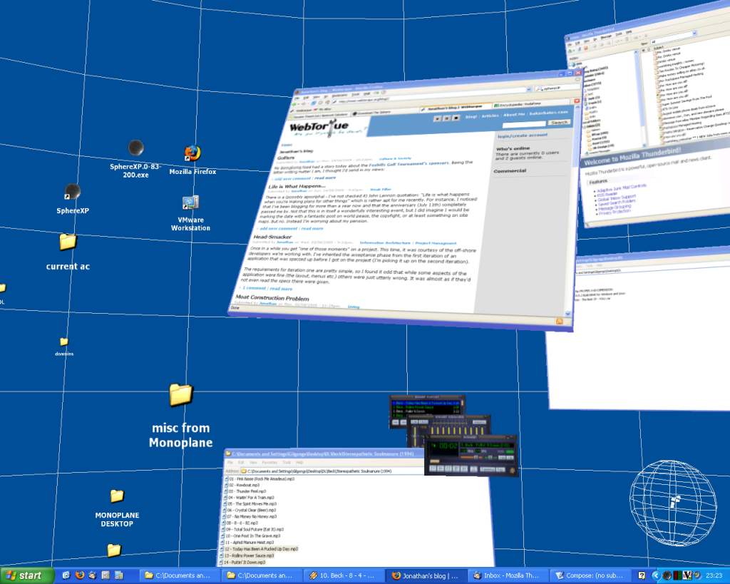
I bumped into SphereXP yesterday, which is one of the experiments in desktop management that’s been going on for a while (well, ever since Xerox PARC I suppose). Here it is running on my machine.
I’m selling a shower rail on eBay, and a bidder has asked me how much it might be send to Germany. That should be easy to find out (indeed, why don’t they look it up themselves the lazy buggers?) I’ve got a vision of a nice form to fill out: dimensions, weight, destination, insurance, etc. And with this in mind I go to the Royal Mail. I go to City Link. I Google.
I’m three weeks into a brand new project, and my mind is on requirements and specifications. Like every project I’ve ever worked on, this is unique. This time, it’s unique because it was half documented and thought about, and was then mothballed. Now it’s back from the dead a year later, and I’m on the case trying to make sense of what was done. There’s one person in my department who worked on it before it was frozen, but the others (who wrote most of the docs) have gone.
Had an informal presentation today about folksonomies. A lot has been said about them recently, and I don’t think anyone’s thinking of them as really serious tools to rival more traditional systems or techniques, but some things that came to mind about the long term future started with that Killing Joke track.
The content mapping monster has started its onslaught, and mother I can feel the soil falling over my head.
Sometimes I think I’m the only person who lies awake at night worrying about content. Well, I don’t literally do that, but it feels like I might be sometimes. I’m certainly gaining broken record status on the issue and thinking crying-in-the-wilderness thoughts at times.
Part of the problem is that it’s hard to articulate what the problem exactly is (well, I find it hard at least). It’s certainly made harder by the fact that according to the content management software industry it’s not a problem that exists if you use a CMS. How could it, since such software “manages” content! And who indeed could possibly have a problem with managing content after they’d spent half a million bucks on the latest enterprise XML format-agnostic end-to-end solution?
Back at the grindstone this week with an interesting foray into card sorting, but this time using a web application while facilitating users (one to one) over conference calls. It’s thrown up some issues, and almost fallen apart at the seams at one point, but I think it’s going to be helpful in the next stage of working out the site’s taxonomy.
When I started this blog I told myself it would be a good place to critique online experiences of various kinds. I’ve actually done very little of this, mainly because it’s unexpectedly difficult: you only realise you’ve got a badly designed experience on your hands when you’re some way into the journey, and back-tracking to record the process is usually not possible. I’ve half caputured this mess of a customer registration journey though – it’s really terrible though.
Although I yield to no man in my respect for the rigour that David Danielson brings to IA research, at times I can’t help wondering if either I’ve got the wrong end of the stick, or he’s up his own a*se.
Busy this last week doing “pixel-perfect wireframes” (don’t ask). I dunno. With seemingly the whole world going with Jakob on this one: low-fidelity, fast iteration prototyping with rapid whatnots; we’re plodding away with Freehand documents and hardly even a whiteboard sketch between them and the A3 colour printer that lovingly prints them out. All this after Visio purgatory and the dreaded “user journeys” as well (the latter not done by me, luckily). All we need now is some site map psychosis and the madness will be complete. Still – if the client’s paying, I’m all for it. And I’m sure it’s good for me to do this… somehow (grits teeth…).
For the past couple of weeks, I have been doing flow diagrams in Visio. These are supposed to describe the “flow” of pages that a user goes through when ordering certain things on our client’s site. They are exhaustive representations of every permutation of that journey, showing the exceptions, error screens, diversions, etc. that are encountered. And sweet Jesus are they boring to do. Not only that, but they’re frustrating, confusing, relentless and needlessly time-consuming. Let me count the ways…
There’s some interesting stuff here, including summary of some research showing that changing navigation in subtle ways actually helps users navigate (and aids their understanding of the depth of the site), thereby seeming to contradict the standard guideline that navigation should be kept consistent. Also talks about other things such as classifying information toward the end of the process, not the beginning. It’s a presentation but has some citations worth following.
Then there’s some page-scrolling stuff that’s good to counter the nay-sayers.
We did a paper-prototyping dry run the other day in preparation for some similar sessions for a client (not involving me, unfortunately). It was the first time I’d done it hands-on, having only read about the theory before. Here we were basically evaluating the technique.
User testing in London and Milan last week. The scripts we’re using for this are pretty complicated, and the client wants us to cover off a lot of very specific questions about the system, which was pretty tough to do while making sure the user was relaxed enough to give us reasonably truthful answers.
Two blog posts in one day. A record!
In what I think may become a bit of a regular feature of this blog, here’s a site that in my opinion has awful usability. Well, it pops up windows like they were going out of fashion. Try this: