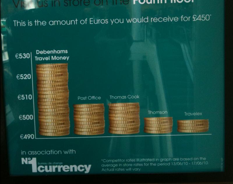
What a Difference a Zero Makes
Not that I expect truth in advertising, but this is a nice example of an abuse of statistical graphics. In this case, a bar chart from Debenhams in Oxford Circus.
You could be excused for thinking that Debanhams travel services are offering TWICE as many Euro for the same price as you’d get from their competition. Look closer, however, and you’ll see the chart doesn’t start with zero on the y axis.
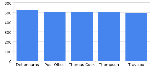
Fix the scale, and thereby make the chart show the data as it really is, and you reveal a rather less compelling picture.
It’s still a significant difference in offering.
Actually the figures themselves give by far the clearest (and most compelling) indication of the offer.
(530 vs 510 or less).
Yes, it’s (I think) about 4% more.
There are probably many other ways you might be able to impress this offer on people without implying that they’d get double the value. What, for example, can you buy with 20 Euro? Something fairly decent I would imagine.