While reviewing a site last week, I noticed the following behaviour in a faceted search UI: Search for something as free text (eg “cups”); get a big list of cups and related items. Use filters to narrow down the list by selecting a search facet (eg “plastic”) Select another facet (eg “colour”). I then see there is no…
Category: Graphic Design
At the trainspotting end of the UX spectrum of activity lie articles like this, from Information Architects Inc., which for some reason I find myself reading. While IA’s article is far too long and badly needs editing, the following occurs to me:
I often complain that infoviz for web stats is poor if you’re not an analyst by trade. Now that I’m working for one of the most popular websites in the world, I should at least come up with a device that could be used to answer the fundamental questions we have when looking at real-time…
There’s some debate about the utility of “high-fidelity wireframes” at work at the moment. It’s a reasonably common topic in the UX chattersphere too, so I thought I’d expand on it here. Firstly, to avoid some potential misunderstandings – let’s make some assumptions about the domain we’re in:
I dislike pie charts. I may even dislike people who use them. But even worse than a pie chart is a quite recent device that doesn’t (I don’t think) have a name. These are the circles that appear mostly in newspapers and magazines to illustrate some quantitative comparison – here’s an example of what I mean. This technique…
Data visualisation (“dataviz” or more broadly, “infoviz”) appears to serve two main purposes. The first is to show data to people who are not analysts or experts. This is so that they can understand some or all of something that has already been identified in that data. The assumption here is that raw tables, or perhaps bunches of charts…
I was having a look at the state of Japanese web design today (we’re doing some customer research there at the moment) and saw this towards the bottom of the home page of the Yomiuri Shinbun site. For those who don’t know, the Yomiuri is the world’s largest newspaper by circulation. I would imagine their website is also read…
David McCandless is an interesting person doing interesting things. Interesting to me, that is, because his work exemplifies something I find deeply mysterious in the way people regard information visualisation. His pursuit of “beauty” seems to be a licence to override clarity, truth, and even common sense. Yet he is widely lauded (here he is…
Regular readers of Webtorque will recall that I put forward a theory of statistical information some months ago, which probably needed to be read in the style of the Monty Python sketch of a similar vein. Today, I have another theory about the visual presentation of statistical information, and it is a theory that is…
I’ve just been watching this video from Adaptive Path in response to Mozilla Lab’s call for participation. The video seems to be more of a PR play for Adaptive Path though, and not a serious attempt at design direction – which is a bit disappointing, but no matter. There are a number of things that…
I’ve not worked on an FMCG site in ages, so I’m taking the liberty of plugging this one, which we did for Sony Computer Entertainment this year. SingStarGame.com went fully live in all territories last week. I’m on there too if you look hard enough. It’s running at about 1,000 registrations a day right now…
I’ve been thinking about “info graphics” again, and what a tricky area this is. It’s doubly so because a large part of what I do for a living is information design. There is essentially an “emperor’s new clothes” problem prevalent in the production of information graphics. To me, the vast majority of subjects that I…
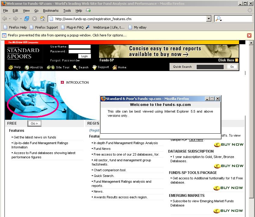
Standard & Poor’s site is larded up to the eyeballs with JavaScript and Flash, and (surprise!) is a broken wreak of a site because of it. Firefox users can’t sign up for one thing. I mailed them about that, naturally, while the chances of them replying properly are of course zero. At least they show you a warning – and a picture of somebody attacking their thumb with a dentist’s drill. Are their designers trying to tell you something?