The User Experience of Britannica Online
I have a 12 month subscription to Britannica Online. This was advertised as a way of letting me link to full Britannica articles free of charge from my blog, should I so wish. Indeed, have a read of this entry, which you would not have been able to see unless you had been a subscriber (try linking to it directly – clever, eh?).
I assume this is an Old Media marketing ploy to get me to buy a real subscription once my free 12 months is up, or at least a tactic to fight back against Wikipedia or something, but that doesn’t concern me here. Instead, I couldn’t resist the temptation to look a gift horse in the mouth.
Much has been said about the quality of Britannica articles compared to those of Wikipedia. I don’t want to rake all that up. Instead, let’s look at something much more interesting: the user experience.
The first thing that hits you about Britannica Online compared to Wikipedia is that the former thinks its Google. Do a search for “snake” and you get all the Britannica articles that contain the word. A long list of entries, many of which you have to assume are irrelevant to your needs. You have to use your judgement on that though of course, and plod through the results.
Do the same search on Wikipedia and you go straight to the main article of that title. But what if that wasn’t what you wanted? Wikipedia handles that with a “disambiguation” link at the top of the article. The use of disambiguation is good information design. People coming into a topic for the first time are given some initial context (the main “snake” article), which in most cases will suffice to let them go further in to the topic (for example a specific species of snake). For the minority who might not be looking for the animal, the disambiguation page is necessary. In the unlikely, but still possible, event that the word was being queried without knowledge of the context (“He met Snake after the concert.”), the disambiguation page is an efficient way of getting to the right meaning. And for everyone, it’s just fun finding out about all the various meanings of the word, regardless of whether you originally wanted to know them or not. Disambiguation is informative in its own right.
Try a search for “grime” on Wikipedia as well. Notice how the disambiguation page comes first. There’s a good reason for that, because Wikipedians assume (rightly in my opinion) that the term has several meanings of fairly equal likelihood of relevance. So again – intelligent information design.
Britannica Online, on the other hand, offers no help in this regard, and no disambiguation. This is the sort of search experience that is often described as being “powerful” by marketing types. I would choose the term “brutal” as being more accurate. Britannica shows that simply indexing a lot of stuff and letting people query that isn’t good enough. What am I supposed to do with 790 pages of “snake”? It may seem a subtle point, but Britannica is not Google. The context of use is entirely different and shows that the designers of Britannica Online do not, to use the argot, “get the web.”
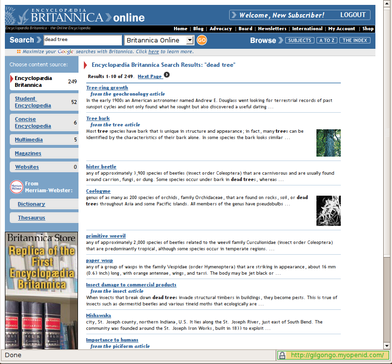
Notice some other subtleties too. Wikipedia has no “browse” link on the site (very large data sets make browsing a waste of time – and they stink of marketing); they collate related articles into schools (content grouping facilitates better research); they massively cross-link (self-evidently useful). These, and many other things exploit the nature of the web and show Britannica Online as being an experience that time forgot. Let me demonstrate with the following two links for the phrase “dead tree”:
http://en.wikipedia.org/wiki/Dead_tree
http://www.britannica.com/search?query=dead+tree&ct=&searchSubmit.x=0&searchSubmit.y=0
I think you know what I’m sayin’.
Hm. Since I wrote this, Britannica seems to have re-designed into some multi-media Encarta-alike. It’s a slightly better experience I suppose. Still won’t be buying a subscription though.
You can’t see the Britannica page to see what’s going on unfortunately.
Really? I can. It’s a huge great “rich application” which crashes most browsers, mind you.