Yahoo! Political Dashboard Redesign
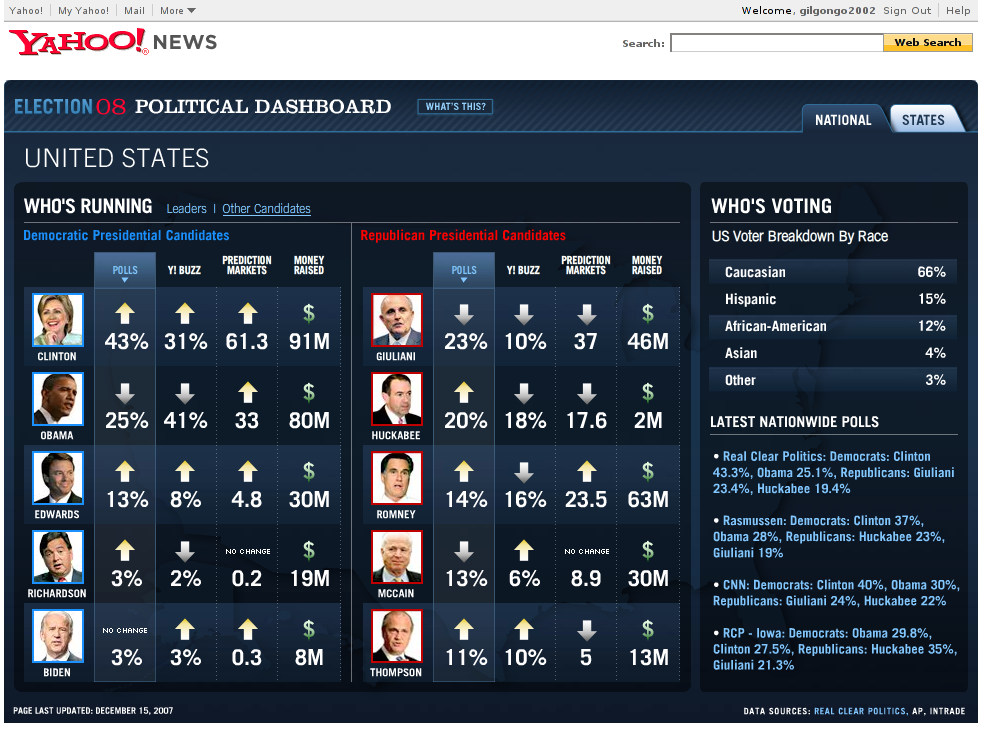
Yahoo! has a “dashboard” to let you track the progress of the various candidates in the US presidential race (at http://news.yahoo.com/election/2008/dashboard). Since I’m currently working on a dashboard myself, I thought I’d have a go at improving it from the point of view of information design.
Firstly though, a critique of the current Yahoo! design, in order of importance:
The division between Democrats and Republicans seems unnecessary. Since there can only be one president, why would I want to track the parties separately like this?
The poll ratings are given rising and falling trend indicators, but they’re not very informative. A better trend indication would give me a feel for the situation. Some candidates might be on slow decline, or others might be up one day, but down the next. Over time, I want to know who is steady, who is on the up and up, who is sinking, etc. None of this is apparent.
The issue of money raised is interesting, and there’s clearly a disparity between popularity and spend in some cases. This is quite hard to pick up though.
The Caucasian share of the vote is huge – that could do with more clarity. And again, context: if stats are available, it would be good to compare this with the last election.
You can click on each column to sort it. That’s nice.
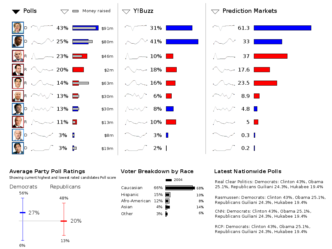
So, with the above in mind, here’s my shot at improvement.
Disclaimers: I forgot to put in the names of the candidates (doh!). I’m not making much effort on the graphic design front – I agree it looks rather less attractive in comparison. I’m also guessing the relative proportions of things like line lengths.
The improvements
Gone is the pointless division between parties. For the faithful, I’ve added a new graphic at the bottom left to show the relative performance of each, with the current highest and lowest poll ratings of any candidate in that party.
Sparklines give a good indication of what’s been happening with each candidate (note that these lines are totally made up for the sake of demonstration).
The use of double bars to indicate the poll rating against the amount raised reveals the disparities here (see Huckabee and Romney).
An interaction note: clicking on the triangles above the main columns would sort them in the same way as the current Yahoo! design does. Note that to sort by money raised, you would need to click on that one of the two available sorts in that column.
UPDATE: Here’s another tack on it (and with some graphic design bits to make it closer to the original). This time, by narrowing the rows, I was thinking it might make comparison easier.
I would also show all candidates (maybe using in-page scrolling) if I could since sorting in reverse order is interesting too.
I’d do the per-state view differently from this to allow comparison with national averages so as to get a better feel for states by party, etc. That’s for another day though…
Oh and one final note: I did this using Open Office Presentation just for a laff. It’s not as good as PowerPoint yet. Hmmm.
Hmm. My comments. I don’t know what Y!Buzz or Prediction markets are. They aren’t explained on either version (yours or Yahoo!’s), I’m guessing they mean something to someone. I feel they should be significantly reduced in prominence (the spark lines could even be overlaid over the main poll figures). On the Y! version a mouse-over gives an indication of the change – without saying if that’s a daily, weekly, hourly or whatever-ly change. It would be nice to see that information (and see it clarified) permanently visible somewhere. It would be nice to see candidates ordered by, for instance, rate of change in the polls (who’s going up, who’s going down). That would be nice. I appreciate the lack of distinction between Democrats vs Republicans, but I don’t know what the main target audience (the US) would think of that. They may have different opinions.
I don’t know what Y!Buzz or Prediction Markets are either, but I assume the audience does. An “About” link might not go amiss though, as you point out.
Rate of change is more important than seeing the sample frequency. In any case, the point of the sparklines is so you can see trends emerging. Since all candidates are polled at the same time, the periodicity isn’t germane to that.
Ordering by rate of change is interesting, I agree, but of secondary importance because you can see that in the sparklines. There are, after only, only about 20 candidates to compare. A “dashboard” implies something that’s not an analysis tool, so I would leave out that functionality for the sake of that rule.
If the audience wants to see the parties tracked separately, then that’s as maybe. My rationale is that doing so is silly because there can only be one president. In the real world I would seek to test that assumption though.
Of course I realise now that the parties are tracked separately because the dashboard is about candidate nominations rather than the presidential election (that comes afterwards).
Ah – that’ll be it then. I never did pay much attention to the American stuff in politics A-level.