Chrome’s User Interface Cruft
The latest versions of Chrome have been showing a “dial” icon for a while, accompanied by a completely unnecessary corruption of the favicons in the tabs:
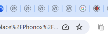
Hover over it, and a tool tip says “Tab active again“. You can only see the icon (and thereby read that message) by clicking on the tab. And that apparently useless messaging is there to entice you to click on it (not all icons are clickable, don’t forget – ah, the lack of any UX conventions…). And if you click on it, you see this:
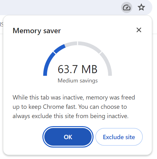
There should be a name of this kind of valueless rubbish appearing in already complex UIs. “Cruft” seems a good one. Why would I want to exclude the site? Is 63MB a lot or a little? Who knows. Who cares?
Whatever.
I’m sure the Google engineers who rammed it in are very proud of themselves. Or perhaps there are more subtle (doubtless internal) reasons for the appearance of this “feature”.
That normal people would have no interest in it shows that Google don’t care about them though.