Piechart Badness. Corrected.
Lovemoney.com has a free personal finance dashboard that I thought I’d have a look at. It’s really an early beta, and they’ve been soliciting feedback and generally being very receptive. So, I’ve just sent them the following email.
By the way, I’ve decided that OpenOffice Presentation, with which I did the mockup, is rubbish. Apologies in advance.
Hi. Sorry about this.
You need to stop using a stupid piechart on the dashboard. See the attached file for why.
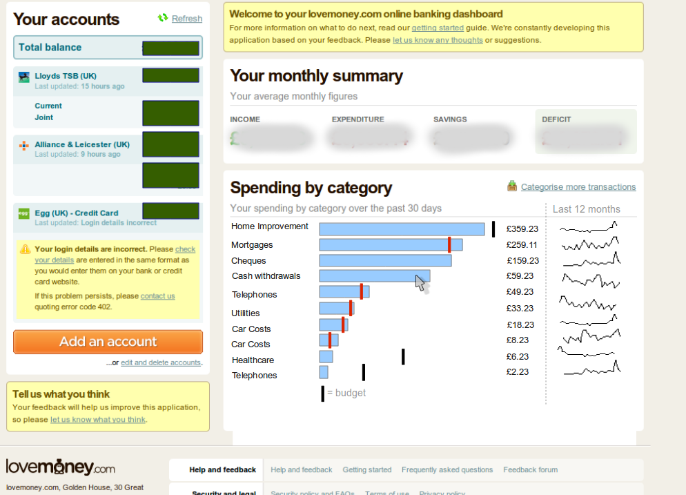
On page one: a screenshot of my existing dashboard. Note the following problems:
– It encodes just two data points: the name of the category and its comparative share of the total.
– There are tiny segments that I can barely click on, or even see.
– There is one segment taking up most of the space (uselessly) on its own.
– If I had more than about 30 segments, the pie would be unreadable.
– The categories are very difficult to compare between each other.
– You cannot (easily) indicate a budget against a category.
– Because the graphics take up so much space, it’s hard to display any other information.
– No comparative data is visible. I spent a lot on home improvements last month, but nothing the month before that. Without comparative data being shown, dashboards are mostly useless, I’m afraid.
On page two: a mockup of an alternative. I’ve spent about 30 mins on it, and I’d have lots of improvements in a couple of hours I’m sure. But this should give you a general idea.
Note these improvements:
– It encodes more than twice the amount of data (5 data points) in exactly the same space as the pie. You could easily show a couple more I think (eg lowest/highest amounts over the last 12 months).
– The category labels are next to each bar. Easy to read off.
– You can see and compare very small differences between categories.
– All categories are equally easy to click on.
– You could have an infinite number of categories and be able to see them all. There are 10 here (same as the pie), but you could probably show 15 in the same space, and 150 would be just fine.
– You could show whether a category is within budget or not, and by about how much.
Good luck with the project and thanks for doing it.
Jonathan
Hi Jonathan,
You have mail :-) Thanks for the feedback. There are limitations with the data analysis currently avaiable on the service.
We are planning to build out an area dedicated to analysis, which we’ll aim to evolve as the service matures. You can read more about the plans for the service, here…
We’ll definitely consider your insights, so thanks for taking the time to contact and blog about us.
Best,
Carl
Product Director – lovemoney.com
Thanks, Carl, for taking notice and replying publicly too.
I’ll certainly look forward to an area dedicated to analysis, but I wasn’t actually talking about analysis in my comments about the pie chart.
In a personal finance context at least, analysis is the activity of discovering why something is happening. That implies you need tools of some kind to look inside the data and play about with it to reveal things not immediately apparent.
A dashboard, on the other hand, is a specific tool with only one purpose: to tell you what you need to know, as fast as possible. It might lead to analysis, but in itself it is not, and must not become, analysis.
So, a good dashboard tells me what I need to know (and no more than that) in under a couple of seconds of study, without interaction, and all on one screen.
Of course, the trick is to work out what it is I need to know (my balance and whether I’m likely to exceed my budget come to mind, but current trending and other things might qualify). I’ll leave that to your analysis to find out ;-)
Believe me – if I’d been talking about analysis UI, my email would have been five times as long.
Forgive me if I’m missing something here, but do you provide LoveMoney with your online banking login details?
Doesn’t that seem a little, erm, insecure?
Yes. And yes, I agree that anyone with an ounce of common sense would laugh at the total lack of any semblance of security in this.