Beware Toggle Switches
The use of “toggle” switch UI in place of check boxes has been growing in popularity over recent years, and is approaching a convention in some contexts (particularly mobile).
But there is a problem with them that designers should bear in mind:
If somebody sees a toggle as a button, then the UI will take on exactly the opposite meaning of that which is intended. And worse, such a misinterpretation is not recoverable in cases where standard wording is used.
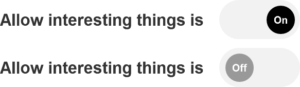
To understand why this is, consider the most common design:
If the interpretation of the toggle is of a button (AKA a call to action), then the expectation of hitting a button is that it will trigger an action (like “Save” or “Search”). So hitting the above toggle “button” will show interesting things in the same way as hitting “Search” shows matches.
After duly responding to this call to action, the “button” then shows that you have clicked it (nice clear feedback!) You are now allowing interesting things to happen.
How Bad Can It Be?
As with many other documented cases of mode error, I’ve seen this problem cause real-world harm first-hand.
At Tes we designed a form to be used as a landing page for customers who had already opted in to being contacted about job openings. At the top of the page was a toggle switch that said “Contact me about job opportunities”. Underneath that was a form for collecting further information about them so that better jobs could be recommended.
Due to build constraints, you were still able to submit the form even if you removed your consent to be contacted (thereby demanding that we must not use the details you sent).
The campaign emailed several thousand people. Of those, a proportion (about 25%) opted out.
But of those, almost 12% opted out but still submitted the form with their details on it.
This meant about 600 people may not have understood the meaning of the toggle, resulting in a potential loss of commission for us.
Can This Be Remedied?
It seems unlikely that the same mistake would have been made had we used a check box, since the conventions around check boxes are stronger than toggles. They have been around a lot longer and are also used off line. Everyone probably understand check boxes.
But could wording also have helped?
Depending on the available wording this might be clearer, but it might not always be possible to add the necessary “is” to the end of the phrase. Including “on” and “off” in the toggle design also doesn’t help either if the toggle is taken to be a button.
Conclusion
Until toggle switches are as well-understood as check boxes, you should consider what the impact of potential misunderstanding might be. At the time of writing, you may see a significant proportion of your audience getting it wrong.
Endnote
As an aside – in user testing, I’ve also seen people attempt sometimes to drag toggles in web apps (and swipe them on mobile):

This seems to suggest a certain lack of familiarity with them, but I don’t know if that means they are also making a mode error in doing so.