Baymard’s Compulsory Fields Controversy
Apropos of nothing much, I was reading this rather controversial bit of research from Baymard today. It’s pretty good, as most Baymard pieces are (although why should I care what percentage of sites do what?), and it contains this example of what it says is bad practice:
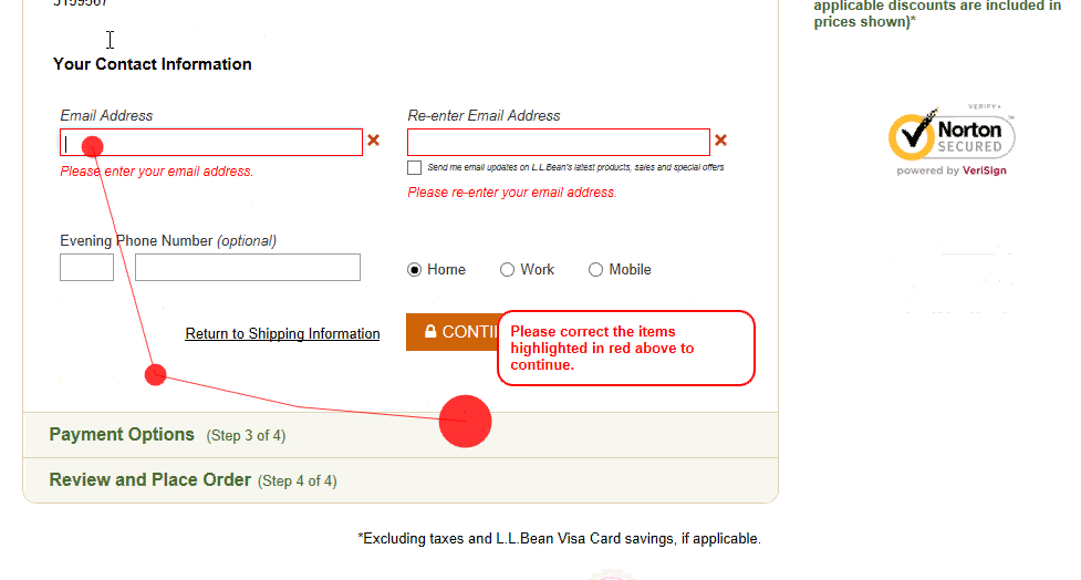
“At L.L. Bean, 22% of users during testing tried to proceed without entering their email address for confirmation, as neither this field nor the email field were marked as required.”
The trouble with this analysis is that it doesn’t address WHY those 22% skipped the required fields. It also treats the issue as a mechanical interaction bug a bit like text contrast or button size.
Because, reasons.
Assuming people understood that they were being asked to provide their contact details at the time, we can also assume they made a conscious choice to decide that email wasn’t needed for that. So why would that be (the Baymard researchers apparently never asked the participants), and what can the design do about it?
I would argue that part of the point of form validation in this context is to help people understand why you are asking for data, not just about catching “errors”. In which case, there would seem to be two approaches:
- Display explanatory messages on some or all fields (eg for the email, “We need this in case you need to change your password”)
- Display explanations only when a compulsory field is skipped.
Method 1 would quickly lead to a rather cluttered form in most cases, and might also be counter-productive if that clutter habituates people into not reading the text (which it probably would).
Method 2 would seem to be the better approach, because it would mean the message would be read at a time when the user was attentive to it “Oh, I can’t submit this form… Ah, I see. Better fill that in then!” (Or perhaps, “Wait, they want to do WHAT with my data? Hell no!”) I would then argue that messaging required fields (for example, with the convention of an asterisk) would therefore not contribute to a better UX of the form, whereas messaging only optional fields is marginally helpful if the label is noticed (and it doesn’t matter if it isn’t, although perhaps some explanatory text would help in that case, assuming optional fields are in a sufficient minority).
But what if…?
Like many UX things, there will be exceptions of course. But I think it’s best to apply the “80/20 rule” to these. For example, the report says:
… we also observed that on sites that only mark the required fields, a smaller group of subjects completely mistook optional fields as being required
The 80/20 principle here is not to annoy the majority of people for the sake of the minority. If a small number of people mis-interpret the UI, and they can recover from their error (which in this case they can) then don’t “fix” this with a sub-optimal experience that effects everyone, because you’re making your experience worse for most people.
As an aside, I think the Baymard article is a good example of why usability research should not be left to researchers to interpret. Research and design are very different skills, yet far too often I see reports where people who are obviously not used to thinking about the overall UX of the system make questionable design conclusions.