Words and Pictures
I just spend my life specifying stuff. There’s just no time for anything else. Creativity, research, even design (always an afterthought…) is pretty much a covert activity when you’ve got the offshore crews to keep happy. But once in a while I feel I’ve made some headway somewhere, however microscopic.
When it comes to specifications, the adage that “a picture is worth a thousand words” will pretty much lead you to failure. For a long time I thought that wasn’t the case. Perhaps, I thought, the confusion that arises in creating and interpreting graphic “deliverables” is due to my inexperience. But after I while I began to suspect something was up…
On my current project I’m over that hill – indeed I’ve probably swung right over the top and down the other side, which will be just as bad. But while I’m in my fool’s paradise, here’s a couple of tales from my current coalface (screenshots cropped for confidentiality):
We’ve been worrying about workflow recently. What will the user be able to do when, and how do things get shunted back and forth within the system and by what rules? So we convene a workshop with the client. I spend some time (rather a lot of time) drawing a nice-looking “content lifecycle” wheel. A thing of beauty: the content starts in one state, then moves around the wheel as various events take place to change its state. I draw some arrows in one direction. I draw some others in another (to balance them out). What could be simpler? Some other arrows come in to the wheel… some others go out. We book our tech lead in on the workshop just to be safe though.
To cut a long story short, “the wheel” ends up crippling our analysis of the system. The tech lead half-seriously complains that it’s not a state-transition diagram, but we shout him down – the boring bastard. Four hours later, we all think we’ve thrashed out the details. A week later, we realise we haven’t. Had the wheel been a state-transition we might have got to that point sooner as it would have forced us to think straight rather than being distracted by geometric eye-candy. One of the guys in Poland freely admits he did not understand the wheel “at all.” A bit extreme, but I think he really meant it.
Then another reminder. The Mumbai Massive (never the most explicit communicators on the project) have been having problems with the specs we dusted off from last year regarding the way some tools in the application are supposed to work. The approach my predecessor took was rather graphically inclined. It seems, however, that this (in hindsight) grossly over-specified minute interactions at the expense of the stuff they really wanted to know. Worse, because it was 80% pictorial, there were no words or annotations to latch on to until I added some. No “… on line three it says…” hooks, or “… chapter 12 mentions…” starters. Just mute diagrams that I’d attempted to “fix” by slapping some apologetic text around them.
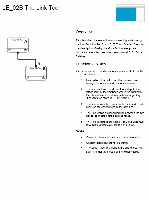
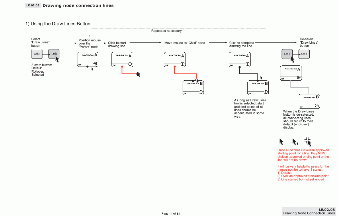
So I decided to turn it inside out. Relegate the graphics to a token, then write it down in words. Bingo, they go away and build it.
I’m not saying this was the best spec in the world (in fact all my specs are pretty awful), but it was better for the purpose to which it needed to be put. And it took me about ten minutes, which is about six times less then I think anyone armed with Freehand and a head full of pictures would have taken.
My moral for this is “When in doubt, use words.”
Found a pic
Found a picture of that wheel (vidcap – hence poor quality)