The Curious Case of “Are you sure?” – the Usecrime That Just Won’t Die
The reasons why confirmation dialogues are inferior to “undo” (perhaps better termed “delayed triggering”) are pretty clear, well understood, and accepted by anyone who has taken the time to read something about HCI. Undo has also featured in usability heuristics since time immemorial.
No serious designer should therefore be specifying confirmation dialogues for significant CrUD operations in the year 2017.
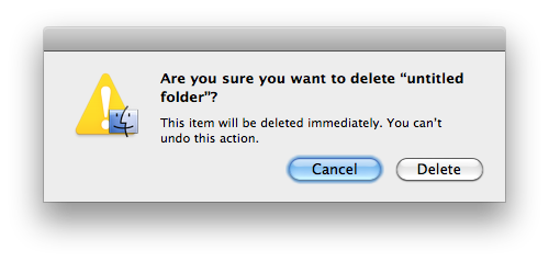
So to see somebody called Nick Babich (“software developer, tech enthusiast and UI/UX lover”) advocating them in his Medium article was particularly galling. Confirmation dialogues are not loving UX, and I told him so in a comment to his assertion that “A strong example of frictions increasing safety comes with a system dialog where the user must confirm a delete action.”
In response to this, he immediately blocked me from commenting on or reading his Medium posts. Such is the state of the “design community” today. Nick, if you aspire to be a designer, but are unwilling to enter into a conversation about your ideas, perhaps selling flowers or window cleaning would be more comfortable occupations.
Why won’t confirmation dialogues die?
The case of confirmation dialogues in UX follows a depressingly familiar pattern in design practice.
Much of what you specify as a UX designer won’t get built. This is mostly due to lack of time or resources further down the line. It’s rare you design something that can’t be built at all, unless you are unaware of unusual technical or business constraints.
But sometimes things don’t get done for other reasons. These mostly belong to a family of UX misconceptions which recur again and again. And they must be explained and re-explained again and again before they can get done. One such is the confirmation dialogue. And I am always prepared for “The Conversation” about it.
Misunderstanding
The first problem, specific to confirmations, is often that software developers hear the word “undo” and assume you mean an “undo stack”. This would allow the current and any previous operations to be undone and re-done at any time. This is very difficult to do with Internet applications. Fortunately though, it isn’t in fact required to achieve the desired aim for CrUD operations.
Before I realised I was being misunderstood, I had in the past found myself in actual shouting matches with developers about confirmation dialogues, so adamant were they that they must appear. But they were merely trying to mask the fact that implementing an undo stack would be too difficult for them to do. This is also an example of another phenomenon: defending poor design as a way of deflecting attention from lack of engineering capability or skill.
A much less contentious term is therefore “delayed trigger with cancel”. That is, the operation in question (a delete, say) appears to have been done in the UI, but in fact has only been scheduled to be done later. The user then has an opportunity to cancel it before it triggers (users of Gmail’s “unsend” feature will be familiar with this).
Once explained, you then need to make sure it isn’t simply implemented as a confirmation with an undo stuck on it. This happens when the operation does not appear to have been done – thereby removing the opportunity for anyone who did the operation by accident to notice and hit undo to save themselves.
Cargo culting
The second problem is our old friend:
“But [insert favourite site/software, usually Apple] does it! It must be good!”
Anyone who says this is revealing that they are either too lazy or too ignorant to think for themselves about the issue. Fortunately, it’s easy to explain why delayed triggering is much better UX, which usually removes the objection.
Ego
In some cases, however, people will say that while they can’t fault the logic of undo, they themselves would prefer a confirmation. This then is the unanswerable territory of faith. It is also a complete lack of empathy for anyone who isn’t themselves. And needless to say, any designer advancing this argument is effectively declaring themselves incompetent.
Punishment
Usually in B2B systems where workers are required to “follow process”: justifying the removal of the ability to correct mistakes is seen as a way of making them train themselves harder to do the job. The logic here (if you can call it that), is the humiliation of sending out 100,000 emails to the wrong list, deleting somebody’s account by mistake, or some other thing that makes the business look incompetent, is seen as somehow better than the business looking competent, saving time or money. Would removing seat belts from cars make people drive better? Perhaps.
A subtle variation on this idea is that if users can correct mistakes born out of poor adhesion to process, this discourages the diagnosis of the root causes of such mistakes. But in fact, the two ideas are related only in the minds of the deluded.
Other things that fall into this category of mental gymnastics are “the fold”; asterisks on required fields on forms; textural explanations of how to use the UI; jargon terminology and needless interactions in the name of “keeping it simple”.
When I started out in design, I imagined that by now these things would have become the smallpox of UX: mostly consigned to the dustbin of history, perhaps only persisting in benighted corners. Yet despite the efforts of Don Norman, Bruce Tog, Jared Spool and others, the Nick Babich’s of this world have proven me wrong by not only presenting flat-out bad design as desirable, but refusing to discuss the matter.
In this, UX design practice has failed the general public. And I think that’s sad.
Footnote
I see that the “are you sure” anti-pattern was implicated in the famous Hawaii missile launch alarm mistake.