What’s Worse Than A Pie Chart?
I dislike pie charts. I may even dislike people who use them. But even worse than a pie chart is a quite recent device that doesn’t (I don’t think) have a name. These are the circles that appear mostly in newspapers and magazines to illustrate some quantitative comparison – here’s an example of what I mean.
This technique has perhaps been legitimised by the likes of David McCandless, who appears obsessed by both circles and the using of areas to represent relative amounts. The reason I dislike this nameless technique is mainly because it’s very hard to judge relative sizes by area as opposed to length. This is of course also a big problem with pie charts. This much-lauded poster of the US budget breakdown is an egregious example, particularly when you consider that most people under-estimate differences in area – which is also one of the reasons why McCandless deserves a special place in hell, in my opinion.
But you don’t have to take my word for how hard it is to judge differences in area, and why horizontal bar charts or their equivalent are almost always better. Here’s a nice game you can play to prove it to yourself once and for all!
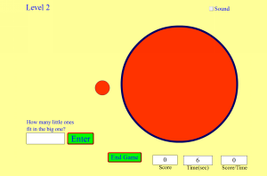
| Click to Run |