The Design System at Sainsbury’s
I worked for the UX department at Sainsbury’s between 2020-2024, and was peripherally involved in the evolution of their design system over that time. While I was there, I wrote the following document (which I have abridged here).
These are the reasons I wrote it:
- While less interested in the theory, I’ve always had a keen interest in the practice of design systems from the point of view of somebody tasked with using them.
- I believed (and still believe) the Sainsbury’s DS was the most advanced I’d ever seen. Possibly one of the most advanced in the world for a company of that size.
- I wanted to analyse why, both at Sainsbury’s and other large companies with complex digital estates, there always seems to be a “perpetual dawn” for design systems – never quite deploying, always in revision or re-architecture.
- There were clear disconnects between stakeholder groups. These had had led to heavy cynicism about the DS on the part of the UX team. Nobody seemed to be addressing that.
So I wanted to see if I could map the “territory” of the DS as I saw it – and attempt to save it from the failures I had seen elsewhere.
As of January 2023 the Design System is a work in progress. This is everything I know about it. Some things may be wrong or confusing.
History for Noobs
Sainsbury’s Design System (DS) was previously known as “Luna”. When Sainsbury’s acquired Argos in 2016, we inherited their system known as “Bolt”. Bolt was therefore used to refer to things for Argos (and later GM brands which use the Argos platform), while Luna referred to GOL’s brand (and tech stack). The Nectar brand styling — while never actually based on a system independent of Luna — was informally called “Syrup”. Habitat and Tu had no systems of their own beyond brand marketing guidelines. They moved to using a “themed” Bolt following their respective re-platforming in 2022/3.
After a period of largely separate existence, in 2020 (and after some initial exploration into alternative approaches), very impressive engineering progress was made towards unifying Luna and Bolt into a single multi-brand Design System (using “Tokens” – see below).
Today, this unification is ongoing. The more “federated” culture of Bolt between engineering teams compares as significantly looser (in terms of what defines a component) process compared to the more controlled one for Luna. But that too is being unified with improvements in tooling and processes into a single system now called Fable (more on which later).[1]
There is still much to do before we can say we have a real design system. And while some of the issues we currently face with the DS may seem depressing, we should not forget that the Sainsbury’s DS stands as one of the most advanced design systems of any in the world. While most designers are not qualified to understand the engineering that makes this the case, we can rightly be proud of what has been created for us.
General Vocabulary
The terms “Luna”, “Bolt”, “Fable”, “the Design System” and “components” are all present in conversations. Their meanings can be somewhat unclear and are also changing.
As of Jan 2023: While the word “Luna” is used generically to mean the Design System, that will change because “Luna” is the term for the legacy “Sainsbury’s-leaning” design system, while “Bolt” is the term for the legacy Argos-leaning GM one.
The “Luna Guidelines” is also the term for the website that houses guidance for the Design System overall.
However, we aspire to have one design system to service all our brands (Sainsburys, Argos, Habitat, Tu, Nectar and any others in future) using the “Fable” system. So the intention is to deprecate all these terms in favour of either “The Design System”, perhaps promote the term “Fable” over that, or resurrect the name “Luna”.
The term “component” is used by engineers to mean a logical entity in the front-end code (with props and other attributes), but not necessarily something re-used across the estate. This use of the term therefore means a “component” MAY NOT be part of the Design System. This is distinct from a “Design System Component” which is agreed to be used across the estate and therefore conforms to strict rules and behaviours for inclusion.
The dual meaning of “component” needs to be always born in mind to avoid confusion about “building components” on projects! See also Key Terms & Gotchas.
Luna, Bolt, Fable, the Luna Guidelines site, and other resources such as Github and Chromatic (not covered here) are currently all therefore the “system” in Design System.
Roles and Responsibilities
The Standards & Guidelines (sometimes also termed “Standards & Operations”) Team manage the DS (the Figma library files are read only to XD). However, they’re a small team so the DS is a collaborative (“federated”) effort between them, XD and Engineering/Product.
For the avoidance of doubt, XD are the owners of the Design System Components because they are responsible for how our systems look and behave. While we can consult with other teams if we wish, we have the final say on what Components are in the DS, how those should work and how to use them.
As of January 2023, XD has no agreed process for deciding on Design System changes (partly related to the fact that we have no agreed definition of what is and what is not a “Component”).
The Ecosystem
The entire purpose of all the work that XD, S&O [hereafter “Design Ops”] and Engineering do in creating and maintaining the DS is to get components into the state represented by this diagram as “Complete”. The three “Realms” it shows, and the names of the “States” between them will be used in the rest of this document.
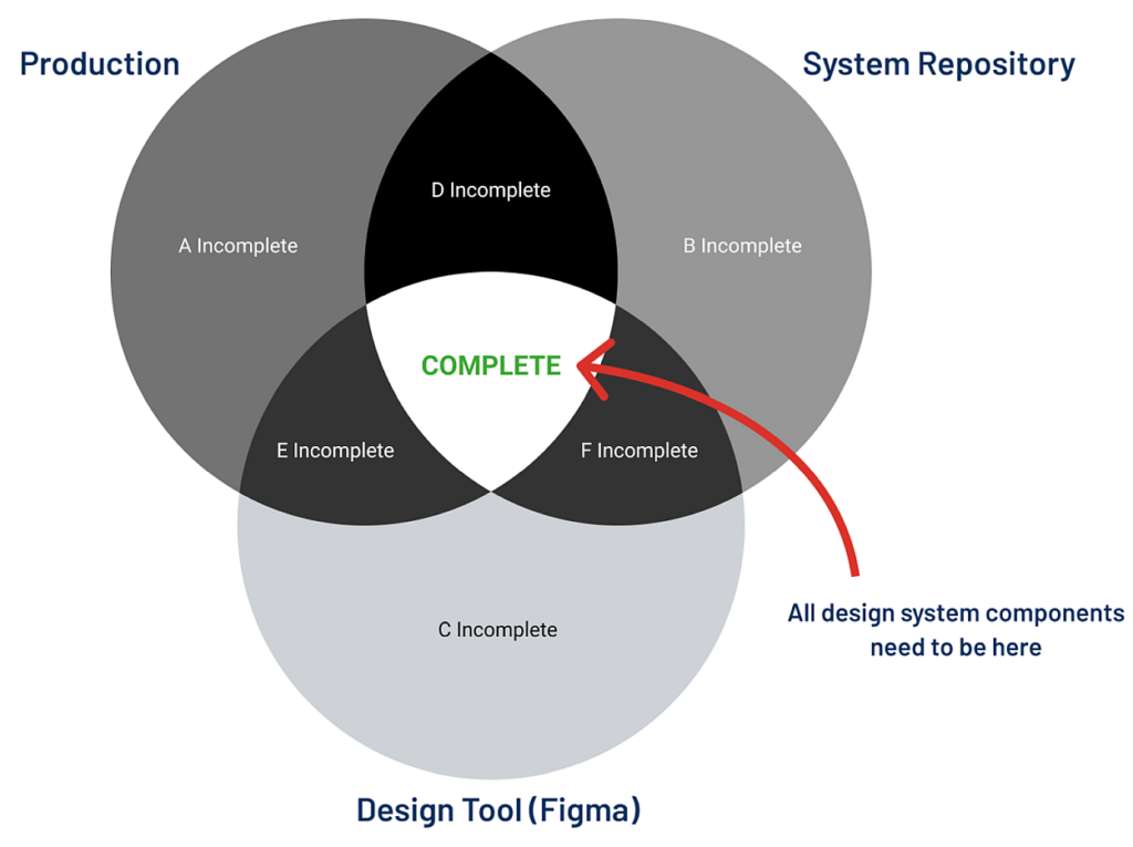
Figure 1: The intersections in this diagram referred to throughout this document.
“Production” is all our digital interfaces: web, mobile native and in theory anything else (for both customers and colleagues). Although much work remains to make it so, a large part of our front end technology can use the DS – this is the key to everything, and a situation that sets us apart from most businesses of our size. [2]
“Repository” is referred to as the Source of Truth for Components (and where their technical documentation resides). Currently this is here for Sainsbury’s (“Luna“) and here for GM (“Bolt“). Both are now being deprecated to converge in Fable, although the above Luna repo is currently where you can see the different brand themes of a given component.
There is also the CMS repository here (which uses the token system common to the all of them).
The Repository is where DS Components “live” in the codebase. While it is theoretically true that if anything is at least “D Incomplete” then what you see in the Repository is what you will get in Production. But there may still be “imposters” in Production or Figma (things that look similar to it but are in fact not it, have overrides in them, or are otherwise “detached”).
The technical transition to the Design System proper is therefore to move from “imposters” (things that look like design system items but in reality are not) and legacy Luna components, to the new multi-brand Fable system.
“Design Tool” refers to the libraries in Figma. Similar to the situation in Production, there are of course many things in Figma files that are not Components, or look like them but are in fact detached “impostors”.
Aside from the components that exit in the CMS (Magnolia), we do not yet have “traceability” of components between the realms.
So we can’t easily know (for example) whether something that appears in Production exists in the Repository or Figma, or whether something in the Repository is in use in Production or not. Each realm is therefore “blind” to the others. See the Appendix for more on this problem.
Strictly speaking, a Component can only be Complete if it exists in all three realms and has no imposters. But for now we would be happy to have something in all three realms regardless. The number of those today is unknown, but probably very low. The number of the ideal “imposterless” type is certainly zero.
Key Terms and Gotchas
A satisfying definition of “Component” is hard to pin down. And it becomes harder the more complex the component and the domain (customer, colleague etc.) something is in.
It seems fair to say that a component should be a usefully reusable item, perhaps unlikely to change over time. Certainly a button, an icon, text style or a checkbox, and maybe a carousel, overlay window, or tooltip. Headers and footers are also components by this definition.
As of January 2023: The Design Ops Team is concentrating on building what they call “Level 1” components only. These are sometimes referred to in other design systems as “atoms” (things that can be used to make other things). Levels 2 and 3 will come later to include things like carousels or other more complex items.
There are also “CMS Components”. These are for use only by the CMS (Magnolia), and are made up of our DS “Level 1” components (Magnolia uses the Tokens for these). XDs may need to refer to these on some projects.
As of January 2023: the exact workflow is being worked out with the CMS and Product teams). The CMS also uses the Design System Repository – see Appendix: “The CMS Taxonomy”.
Unlike other parts of the DS, the CMS does have some “traceability”: we can tell whether and where a given CMS Component is in use in Production (and all its components by definition also appear in the DS Repository).
A Token is mainly an engineering term which XDs can think of as the mechanism by which the same Component can switch between brands. Components in Figma are built to be Token-compliant to ensure a match between them and what appears in other realm, but they do not affect designers working in Figma because they use separate Figma libraries for each brand.
As of January 2023: The “brand switcher” (”Select a theme to demo”) in luna.sains appears to work, but it is NOT always accurate for any GM brands. Use the “Theme” button in bolt.argos for those. This will be fixed when all components move to Fable.
Currently, tokens only relate to some, but not all, visual elements. So while colours, text and gestalt elements like spacing, texture etc. can change, higher-level decoration and interactions cannot (eg an error in Nectar animating, but errors in other brands kept static). This results in certain “levelling” constraints between brands. An example of this constraint may have been seen in the Tu migration to the GM stack. This resulted in Tu’s migrated component styles being nicknamed “Black Argos”.
As of January 2023: While the Design System is constructed around a common grid for all brands, that grid is not yet reflected throughout Production. This means that in some cases components cannot be used without more fundamental work on the codebase (see also the “Capex Problem” explained in the Appendix). This is also a factor contributing to things being added to be A incomplete.
As of January 2023: The work of making Figma components token-compliant may only be done by the Design Ops Team as only they (may) have the necessary skills and understanding for this.
Libraries in Figma
As of January 2023: there are many shared libraries in Figma (probably to be deleted over time),but only the following are “official” in the sense of being updated and maintained and part of the Design System tokens:
- Sainsbury’s – UI Design Library
- Argos – Bolt UI Design Library
- Tu – UI Design Library
- Nectar – UI Design Library
Note that the Figma “properties” of the Components in these libraries are (sometimes) intended to cover mobile native as well.
Brand switching per component is not enabled in Figma (as it is in the Repository). This is to simplify usage in the tool.
As of June 2023 There is currently a reasonable, but not complete, set of components available for official (tokenised) use in each library. Page templates (and grids for those) with headers/footers are also absent from the Design System.
What to use and how to use it
[2025: Various notes removed as largely not relevant now]
As of January 2023: An important but largely missing aspect of the DS is usage rules (AKA a “patterns” or “principles” – the term “guidelines” is unhelpful in resolving disputes), but better thought of as rules for the use of Components and the contexts in which they exist. Not having rules means customers and colleagues having to learn different usage patterns between systems, or worse – between different parts of the same one.
These principles are important to help engineers working on projects without designers on those teams. But it will also benefit XDs to help them know where submit buttons go, how we display dates, when not to use labels or popups, how form validation works, and why, etc.
A draft of a document for this is here.
Making Changes to Components
If you simply want to request a missing component, you can do so here.
As per Design Ops Team guidelines: try not to detach official components because doing so invalidates the point of having a design system in Figma (although see Appendix: “Why Keep Figma Pixel Perfect?”). If you need to you can do it, but please first raise it with your line manager to discuss/explain. Your line manager should then work with you to get agreement with the wider XD team about making a change.
You can then use the above form to notify the team, create a Figma branch with the changes in it, and request a member of the Design Ops team to review when you use the form (please add an explanatory note to the branch too). They will then check it and merge if technically OK to do so.
It may be necessary for XDs to have Github logins in order to use Chromatic to track the progress of components in development. Need to investigate this as of January 2023.
If you have read this document so far, you may well ask what the point of making a change to a component in Figma is if there is as yet such a low chance of it making it into production.
The answer is that we would hope that such a change has had some good thought put into it. So when the time comes that these changes can be built, the design work will have already been done. It is worth doing.
Appendix
The CMS Taxonomy
To avoid XDs specifying page layouts that cannot be reproduced by the CMS (Magnolia), designs in Figma need to have the following things appearing between the site header and footer, and/or along with non-CMS content:
- One or more “Areas” containing one or more Components. Some Components (TBD?) cannot be used in some Areas.
- Zero or more “Grids” inside any Area. These can be added to Areas to subdivide them into two or more slots for Components to appear in. Some Components cannot be used by some Grids. Refer to the CMS Imperial Cheat Sheet [pending] for the details
- One or more Components inside an Area or Grid, to display text and/or image content in the page. Each component has “Props” which can be changed by the designer to determine how they look (eg text orientation, or the use of an image vs colour background).
- Each Component will behave according to the viewport and (global?) breakpoints. This includes Grids which contain components.
- Finally, each component will adopt the appropriate brand style for the property on which it is shown.
Note that since any given component can appear on any brand property, it must be constructed with that in mind.
The creation of new components is rare. 99% of all projects can be serviced by the existing library.
Existential Threats
Engineering and the “Capex Problem”
The greatest threat to any design system is the inability to get things into a “Complete” state (as per the Venn diagram above).
No matter how elegant or complete our library of components in Figma or in the Repository, if engineers do not build and maintain those into Production, the expected UX gains, cost savings, speed and efficiency improvements from a centrally-managed and versioned system will never occur.
The main barrier to getting to Complete is money. The business wants to capitalise as much cost as it can against profit-making projects. Time spent on things that do not meet that definition are “operational” expenses to be minimised.
Design systems are therefore an operational expense if, for example, it would be faster to bespoke, override or detach a component for a project rather than take the time to integrate it properly into the front end using the DS.
Similarly, unknown numbers of what appear to be components in Production are in fact “impostors” (“A Incomplete” or “E Incomplete”). The work of tracking these down and replacing them with the real ones (”blade running”) is a cost to the business. So it might never get done, and the expected benefits of a design system are eroded if not actually eliminated entirely.
At Sainsbury’s, we plan to solve the Capex Problem by giving front-end engineers personal development goals to do the operational work of building out the Components or “blade running”.
We also hope that if the tooling provided for this is easy and quick enough to use, this may also happen during project work too.
We assume that over time we can move enough of our DS Components to Complete so that maintenance of the DS will then become part of Business As Usual. The Capex Problem will then fade away.
A lot rides on this assumption. 😅
If the above situations exist long enough, we may as well give up on the idea of a design system.
Lack of Traceability
(See also my earlier thoughts on this)
With the interesting exception of the CMS (Magnolia) — which does know where its components are being used, and also exposes the name of the component in the DOM inspector — the inability of the DS to “know itself” will be increasingly problematic over time. Particularly when or if “Level 2” and “Level 3” components start to exist.
As a designer or developer wanting to propose a change to a component, I need to know whether, preferably how often, and ideally where, that component is being used in Production. Otherwise, how am I to make a decision to modify, replace or delete it?
It’s perhaps also an issue (if less impactful) that there is currently no easy way to tell what is an “imposter” and what is a genuine DS component in Production (or a DS component being in some way overridden). In terms of Figma though, this issue may be less important (see Appendix: “WIP: Why Keep Figma Pixel Perfect?”).
The problem of traceability may not matter much in the early stages. But in years to come is has to be solved in the same way as the Capex Problem must be. Otherwise, without the ability to know what is going on, we will eventually arrive back in the situation the DS was originally at least partially intended to address in 2016. 😥
Colleague vs Customer, Local vs Global
Historically, colleague-facing systems have tended to be 3rd party and unable to use the DS for technical reasons. This is now changing as we move to more API-based control of UIs. Systems like Vehicle Checks and the Online Orders Portal have meant them getting closer to the customer-facing ecosystem (eg React etc.). 3rd Party UIs without suitable APIs will always be a dead-end, however, and we can only hope future procurement will prioritise this as an issue.
But Components designed for customers use aren’t automatically good for use by colleagues. A good example is tables, which are heavily used by colleague systems in a variety of different contexts, but only lightly deployed for customers. Or the Mary Anne typeface, which has poor legibility at smaller sizes. As of January 2023 there is an initiative to audit the DS for its suitability for colleague use with an expectation of a number of changes being implemented over time.
A related concept of “local” DS components has also been discussed. Might some engineering teams maintain libraries of things that are useful to their specialist context while not being useful to others?
This is hard to reconcile with the idea of a centrally-managed design system because it implies “managed chaos” if teams can unilaterally define what a “component” is. But in a sense this is being done informally today – and partly the reason why we have seen things in bolt.argos that are not part of the DS. Consider also the “CMS Components”, which might also qualify as “local” to Magnolia.
This issue is largely unresolved and needs more thought.
WIP: Ways of Working – Why Keep Figma Pixel Perfect?
THE FOLLOWING NEEDS THINKING THROUGH A BIT MORE – it may not have legs… 🙂
Obviously, creating pixel-perfect components in Figma is necessary simply so that they can be used to specify the corresponding components in the codebase.
Then, when the resources become available as part of the solving of the “Capex Problem”, we will have the specs ready to go. Until then, they remain as C Incomplete orphans, but at least available to keep stakeholders happy.
But to what extent is it useful to keep components pixel/state perfect after that? Currently, only one or two people have the skills in Figma to make things “token compliant”. And the line between components and non-components (things unique to that UI) isn’t obvious. Designers treat all UI equally on projects.
Because of the high fidelity of the resulting DS components, creating high-fidelity screens is also necessary for a sense of visual continuity. But this creates a “fictional” UI, and does not encourage referencing the build early on – in other words, how do you know it will work like that?
Living in a Figma pixel-perfect fictional UI is the reason most designers at Sainsbury’s never look at the staging servers or stubs at all. Yet it is common for them to complain about lack of adherence to their designs when they eventually see their work in the live environment (sometimes months after any possibility of change has ended). And it is common for them and others to express the need for front-end developers to be involved early on in projects.
What better way than to encourage the latter into the design process by having them build out the real UI for inspection by designers and other stakeholders at an early stage? Use Figma for the initial spec, then have all eyes on the build after that.
So perhaps a better way of working with the Design System would be to have a clearly-understood divide between components being used on the page, and “bespoke” elements for that project.
Figma itself also introduces new features which sometimes represent breaking changes to the way things are built or maintained in that tool. And we can expect further upheavals and upgrades from them (Figma is still very primitive in its interactive prototyping abilities, for example). Having to “retire” Figma library items in the name of build elegance seems counter-productive.
Recasting the role of Figma in this way might also mean we don’t need a hard definition of what should and should not go into a library (beyond Level 1 at least). This also means we’d no longer need to care too much about C, F or E Incomplete states, or traceability from Figma to the other realms.
This is of course NOT to say we abandon the idea of components in Production or the Repository. Figma would need some unambiguous way of indicating that something on the canvas is supposed to be an official DS component, and of course to specify it. Otherwise, developers would be confused in the same way as when designers detach and bespoke components today.
But the combinations of Level 1 and 2 components could be many and various (eg product cards, or a whole PDP in editable form). Why not have those combinations to hand and simply embrace the lack of visual fidelity? Have more eyes on the staging servers while keeping tokenised components in other realms tight.
This question deserves more examination, and is also one that has come up in the context of improving ways of working in relation to CMS (Magnolia) builds.
—
Related documents & Useful links
- Draft: DS Conventions & Rules
- Design Systems/Fable GitHub Repo
- Storybook & Fable
- Slack – #design-systems-hub
- Demo repo to show how to get setup with fable
- Component missing feedback form
[1] The DS also includes copy and accessibility guidelines. This document does not address those yet.
[2] Note that for the purposes of this document, the CMS (Magnolia) is part of the Production realm.