Spaceship Design Masterclass
Axel’s been showing quite an aptitude for making cubic structures. While most of his peers are content to pile up bricks repetitively, perhaps with the occasional asymmetric flourish, he prefers to create a base, then build Guadi-like cathedrals using the properties and shapes of the materials rather architecturally. Last week Kumi showed me something he’d made that was actually a little spooky in its complexity (remember, Axel is only just four).
He has been doing regular re-designs of a spaceship in Lego, and frankly, I’d be quite proud if it was my own work. Have a look at the following sequence of design iterations over a period of some days we monitored:
Day 1:
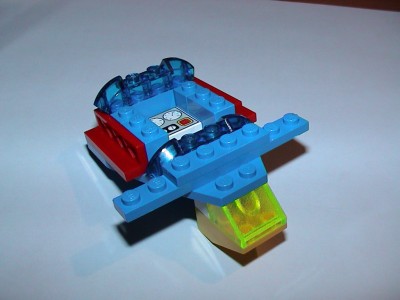
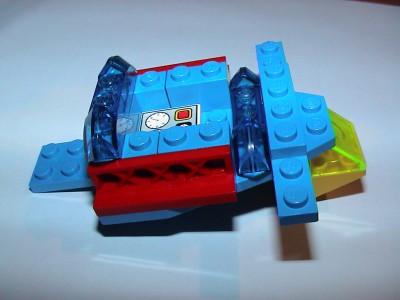
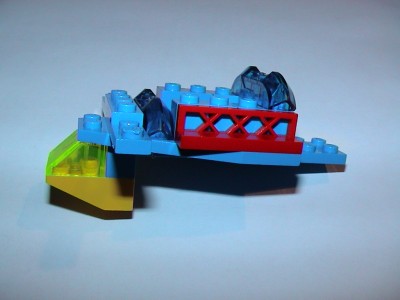
Note the delta-wing base, instrument control panel and underslung cockpit with yellow windshield.
Day 2:
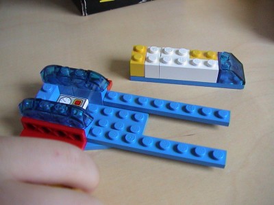
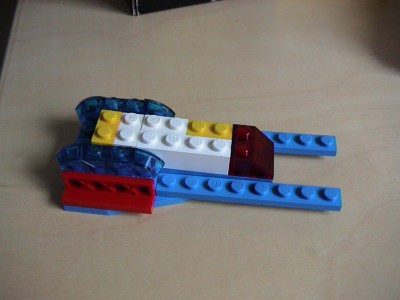
A new treatment based on the same delta wing (in mid-iteration), but with detachable “rocket” capsule and engines at rear. Note the aesthetic experiment with the replacement of the blue windhsield for red in the second photo.
Day 3/4:
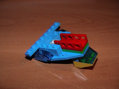
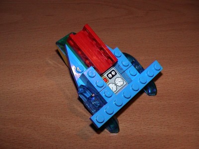
Back to enhance the original design concept using the underslung cockpit again, but this time combining the “rocket” launch pad idea (here seen empty, but sometimes loaded with non-Lego ordinance) and with engines positioned further back with winglets introduced.
Comparing the design from day 1 with day 4, there are some very clever and subtly balanced changes taking place using only about 10 to 14 pieces in all. The design has since gone through several more iterations, but it’s often too fast to take photos of them before he re-factors. This is an approach he takes quite regularly – choosing designs he likes and then re-working, often returning to older themes but building in ideas from previous iterations. Oddly though, he has no interest in 2D design or drawing and isn’t yet writing his name.