Site Maps and Other Illuminated Scrolls
I was talking to a project manager the other day about a job. I was a bit worried by their request for Photoshop skills along with the usual UI documentation and requirements management stuff, but I told myself I could delegate that if need be. They also said on the phone that they wanted to see examples of my “site maps.” I thought that must be shorthand for project artefacts in general. No problem – I had some examples. I don’t actually have any site maps though, but I’ve done a few.But somewhere in the back of my mind, a big dog was barking…
So I arrived on the day to strut my stuff. After some cursory glances at examples of wireframes, use cases, content catalogues and so on, it became clear that the absence of a site map in my porfolio bothered them. When I detected this, I told them I thought these were probably of limited utility in any other capacity than a visual executive summary at the start of a project.
The force of their reaction to this took me by surprise. It was something like telling an old vicar you thought the Bible to be an amusing work of fiction. Did I not believe that the site map was central to the project? It should describe the site! “Everything?” I asked. “Everything”, they said – and sat back in their chair with their arms crossed.
After some brief discussion about this it seemed that they saw the role as being that of some kind of master site map craftsman: someone possessed of the art magically to communicate everything about a web site in a 2D image. It seemed that if only they could find such as person, their client would be happy, and that’s why there were now hiring.
I started to tell them why I thought this was a little unrealistic, but their body language was all too clear. The interview was over, and after some perfunctory shaking of hands, they showed me out through the back door. I thought that was a little harsh, but clearly, I was not of the true faith.
Why?
For as long as I can remember, and for reasons I’ve never fully understood, “site maps” have dominated the new media development landscape. They have the curious distinction of being the one artefact that perhaps all new media development teams are familiar with, yet no two maps seem to be created for quite the same purpose, in the same way, or even by the same people, to describe the same thing. Sometimes they represent “sections” of the site. Other times they include content types, or “areas” of various kinds outside of the physical site structure. Sometimes they’re bristling with labels in 8-point text detailing the requirements of each “page,” or have complex icon schemes to represent things. Like the proverbial box of chocolates: you never know what you’re gonna get. But with site maps, you also get indigestion.
Intrigued by this, I began to collect examples of site maps several years ago. These range from the comically simple (A4 diagram of plain white boxes connected by lines to other boxes in a tree-like structure), to the frankly unhinged. One example of the latter type (sadly lost in an office move a few years ago) being a psychedelic collection of overlapping, coloured blobs of different amorphous shapes and sizes. These blobs sometimes contained other similar blobs of a different colour, and all contained a sprinkling of little icons, the key to which ran around the edge of the picture. It all took up an entire A3 page, and once you’d found a colour printer capable of reproducing it for your meeting, you had to spin it around on the table to read the key. I recall the home page was represented as a small black dot in the centre giving it an appearance of being a kind of galaxy. It must have taken days to make, but it was impossible to understand what it was all trying to convey.
Happily, most site maps fall somewhat short of this spectacular example of weirdness. Nevertheless, there is a definite feeling in new media circles that they are worth lavishing much time and energy on. I don’t doubt they are useful to a limited extent, but sometimes I suspect they are an excuse to avoid proper documentation. They may buy the team a degree of freedom while creating the appearance of rigour. Or perhaps they simply divert attention in the first week or so while the rest of the project starts up in the background – a kind of real-world splash screen.
The effect of this, however, is that the client’s gaze then becomes unhealthily fixed on the site map. Somebody on the team (usually without much of an idea of what is supposed to be communicated to whom) is then tasked to “update” the site map by loading it with figurative baubles that “explain” things like system requirements and content descriptions as they arise. It is at this point that the site map becomes the Emperor’s New Clothes, and it’s usually the developers – who need to be given a proper idea of what to build – who point out the obvious. By that time, however, there’s little time to produce any proper documentation, so the developers simply make their own decisions about how things are going to work. Good luck!
Good For Something…
But let’s accept for a moment that site maps are useful. My definition of a useful project artefact is that it possesses a power to communicate something better than other methods. So for instance, what can a site map show that a plain text document or other artefact can’t? The vanilla variety mentioned above would seem to be a visual representation of a table of contents. So, a site map along those lines might looks like this.
But it may as well be represented like this:
HOME
About
Case StudiesContact
Services
Prices
Example
Contact
News
Press Releases
Boring, yes, but note that it would have taken me about five times longer to create the diagram than it did to type the text version. Not that this is a hugely significant thing in itself, but in the context of a busy workload, it can really help if you don’t have to worry about snap-to-grid or whether those boxes are too big to fit across the horizontal. Text is so much more forgiving: it wraps, it scales, it’s searchable and can contain as much detail as you want. Anyone can edit it at the drop of a hat, but most of all, everyone can read it without having to have it explained to them first.Nor is a textural site map necessarily non-visual. I’ve seen icons used in text, and you can put links in to other parts of the document as well to aid clarity when read off a screen (dead trees are not hip). Try turning it into a clickable table of contents to take you to the relevant description of each section, for example. But by then you’ll be hooked: the power of words will reveal themselves to you and you will be able to see the site map for what it is: an executive summary of groups of content!
But what about those connecting lines? Surely they convey something to do with the relationships between sections that text can’t easily supply? If by this you mean that the site map shows you have to click through Services, then News to get to Press Releases, then no. The site map isn’t showing a navigational system. At least I hope not, because that would mean you could not get to the home page from Prices. The connecting lines mean nothing other than the conceptual relationship of the content in somebody’s mind. In fact, if you consider that the user can enter the site via Press Releases, that hierarchy turns on its head anyway.
So if simple site maps can better be done in text, what about more complex ones? Is not a picture worth a thousand words?
Have a look at this one.
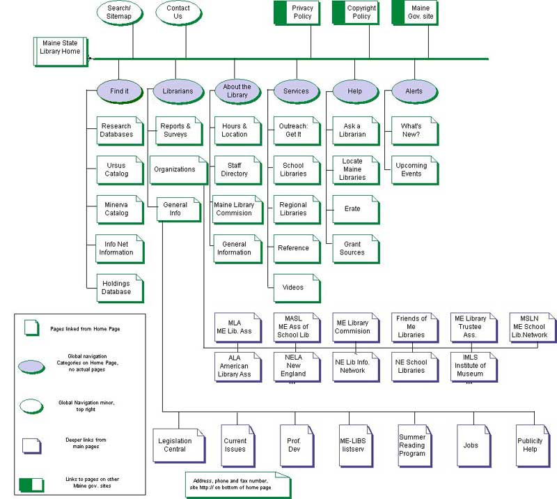
While this seems a bit more advanced, we can see the author beginning to struggle with the First Great Problem: navigation. How do you represent that as part of the map? Here, the author has made a stab at it by using blue ellipses, helpfully noting in the key that they are not “actual pages.” So it’s not just representing pages any more then? No. The floodgates then open. Those boxes could start to mean anything just when you thought you were getting the hang of things (I won’t ask about the connecting lines..). To solve the First Great Problem, how much easier and clearer would this be if we just made a sketch of the main page templates, marking the navigation on them, and used the aforementioned “vanilla” text map to speak for the overall content presentation? Or we could just have a table of contents and start writing up the requirements from there…
I Give Up
For some light relief, let’s now go from the sublime … to the ridiculous. Now this one’s interesting. Oh, it’s a real map. Sorry!
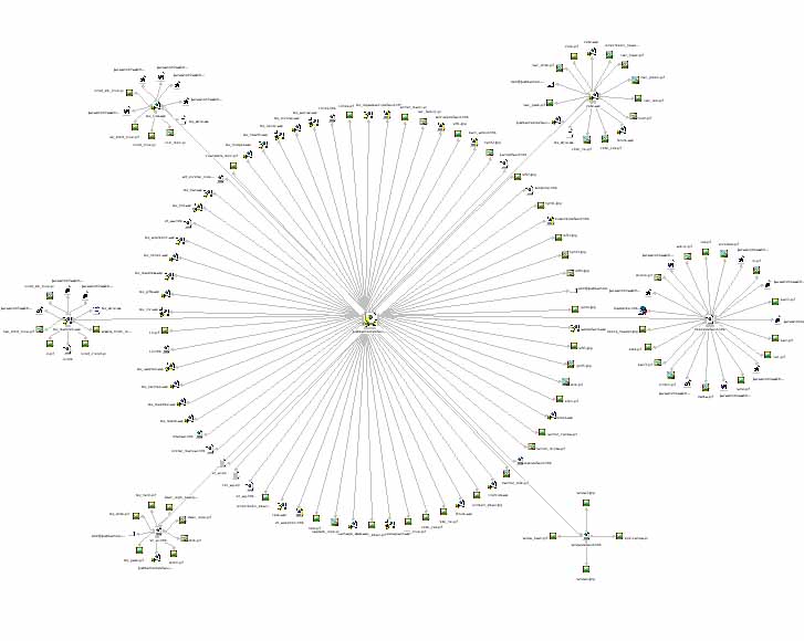
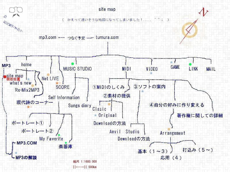
This last makes a semi-serious point. It seems to me that we want site maps to be like a real map – showing paths through things, the location of mountains or rivers. But when applied to information in a non-linear medium I would say it simply doesn’t work.
—
This essary was originally written in December 2003