Is a “Graphical Drop-down” Better than a Row of Icons?
At the trainspotting end of the UX spectrum of activity lie articles like this, from Information Architects Inc., which for some reason I find myself reading. While IA’s article is far too long and badly needs editing, the following occurs to me:
Icons take up minimal space and look better than plain text, so they tend to be used for commands in UIs. However, the use of icons can also exhibit an anti-pattern like this:
- The icon itself is unrecognisable or unfamiliar, so it needs a text label.
- The text label is often cryptic because it has to be short to fit the space.
- A tool-tip on the icon/label is therefore used to explain the command.
- So you have therefore to interact with each icon/label to understand what it does.
If we find point 4 acceptable, then a drop-down menu would in fact be better than a row of icons and labels. With a drop-down we can see all the command descriptions in full with a single interaction, as opposed to multiple interactions with icons/labels (assuming that points 1 and 2 are true). The drop-down uses minimal space, and tool-tips could then be used to message keyboard shortcuts for the geeks in the audience.
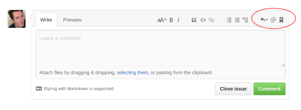
Would those icons be better as a “graphical drop-down”?
So for example: