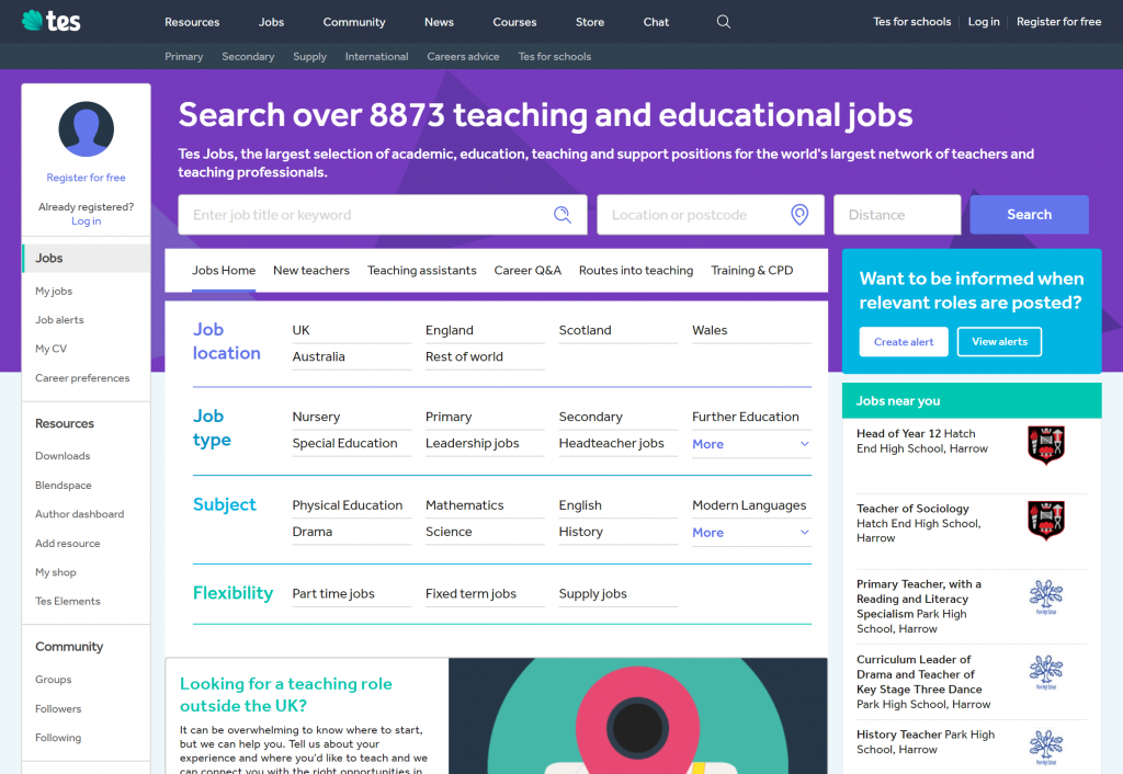
Tes.com Navigation System, 2017-19
To re-architect the overall navigation of Tes.com (desktop and mobile web sites) to unify the UX of the product and raise brand recall.
The UX challenge
Perhaps uniquely, Tes presents as a single brand requiring its audience to make large conceptual leaps to understand the proposition:
- Job opportunities for teachers
- Recruiting and general management services for schools
- A marketplace for teaching resources and materials
- Teacher training
- A print publication and subscriptions
- News about the education sector
- Purchase of Tes-branded educational products
- Discussion communities and social mechanics
Each section of the site had its own conventions and vocabulary often clashing with that of other sections.
Meanwhile, market research showed that while brand recognition was high in the UK (but not in target markets in China, US or Australia), brand recall was often low depending on the demographic. Adoption of new products was a problem in particular.
The business challenge
While everyone complained about the site’s poor navigation, improving it wasn’t on any product road map. So we had to “piggyback” on existing and planned projects to make the changes we wanted without unacceptably disrupting the UX of the site in the process.
This was not a trivial task. Parts of the existing navigation used business-focussed IA and technology-led interactions. But making this more user-centric sometimes implied a large impact on the way existing products were constructed.
This was a cross-team project in which my task as Head of UX was to work with the relevant team’s product managers and their designers to understand the nuances of product strategy and user needs in order to steer the best path to the desired changes.
What we set out to do
The primary goal was to raise brand recall in our key demographics and raise the amount of cross/discovery navigation into other products.
One function of navigation is to act as a “table of contents” for a website. We made the assumption that consistent navigation across the site would help teachers understand more about us. Even if their immediate tasks were not relevant to that navigation, seeing key vocabulary on the page would encouraging return visits to investigate later on.
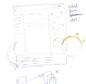
A sketch to persuade myself, if not other people.
To do this we wanted to apply a single, consistent navigation across the entire site. Given the variety of features, a consistent navigation was essential. Although link rich, our design still showed users information across the entire site.
The project
I led both the UX of the project and worked with the various product teams to piggyback on their roadmapped projects; prioritising changes and looking for opportunities to advance to our goals.
Step one: high-level research
I first organised an online (open) card sort of 68 teachers over two weeks in order to look for patterns in their mental models of our content and functionality. Not unexpectedly, this showed little agreement overall and suggested a wide variety of alternative vocabulary. But it did point to a split between items relating to “you” (eg your saved jobs, purchased products or resources) and those relating to “Tes” (news, the marketplace, or course catalogues).
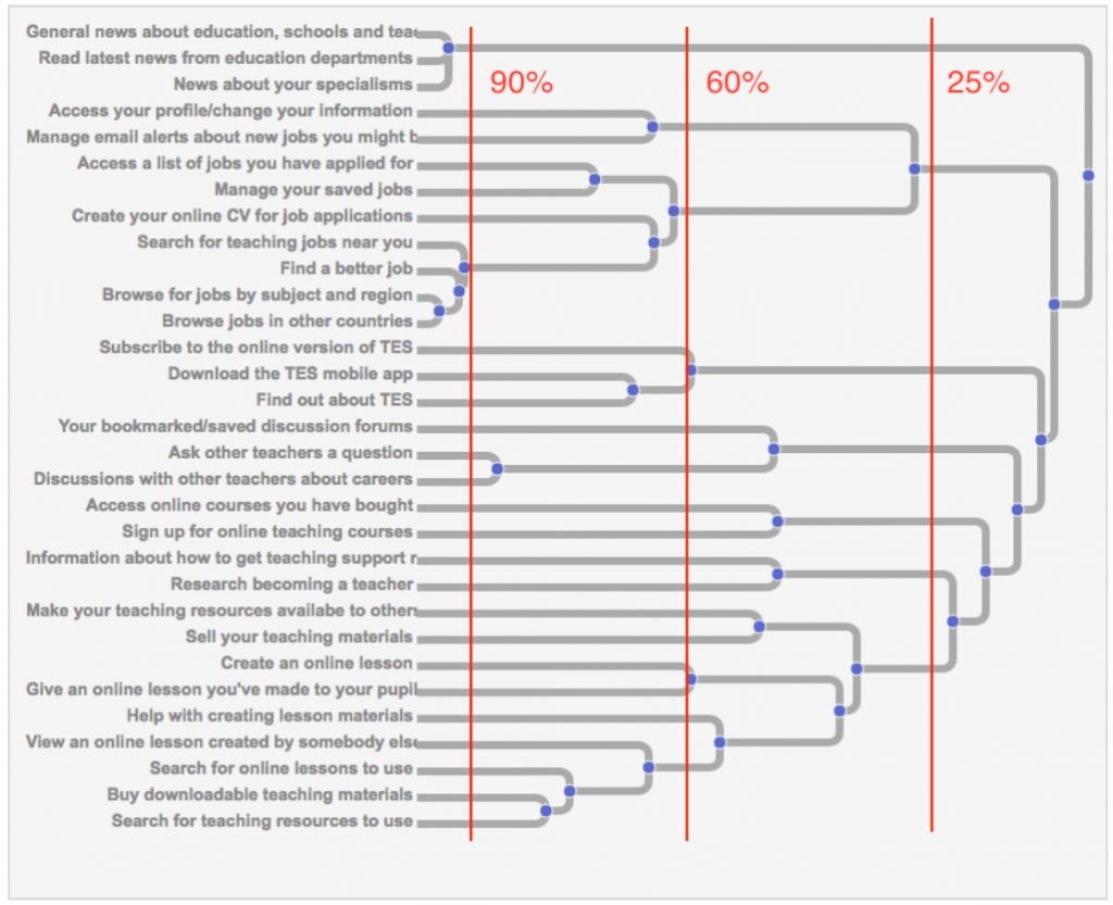
A cluster summary of the data. Not much agreement – but informative nonetheless
Focusing on the business need for acquisition and retention, I then worked with product managers and their UX designers in informal workshops over the following months to come up with better vocabularies informed by the card sort.
Along the way, I also introduced the idea of a “new feature on-boarding” system that used the proposed navigation as a platform on which to highlight features users may have not yet considered.
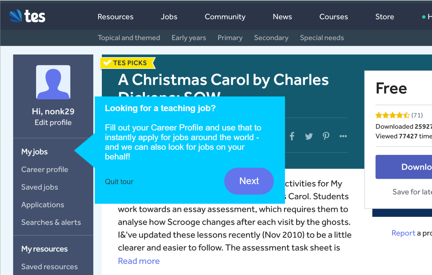
A mockup of how “new feature on-boarding” would work.
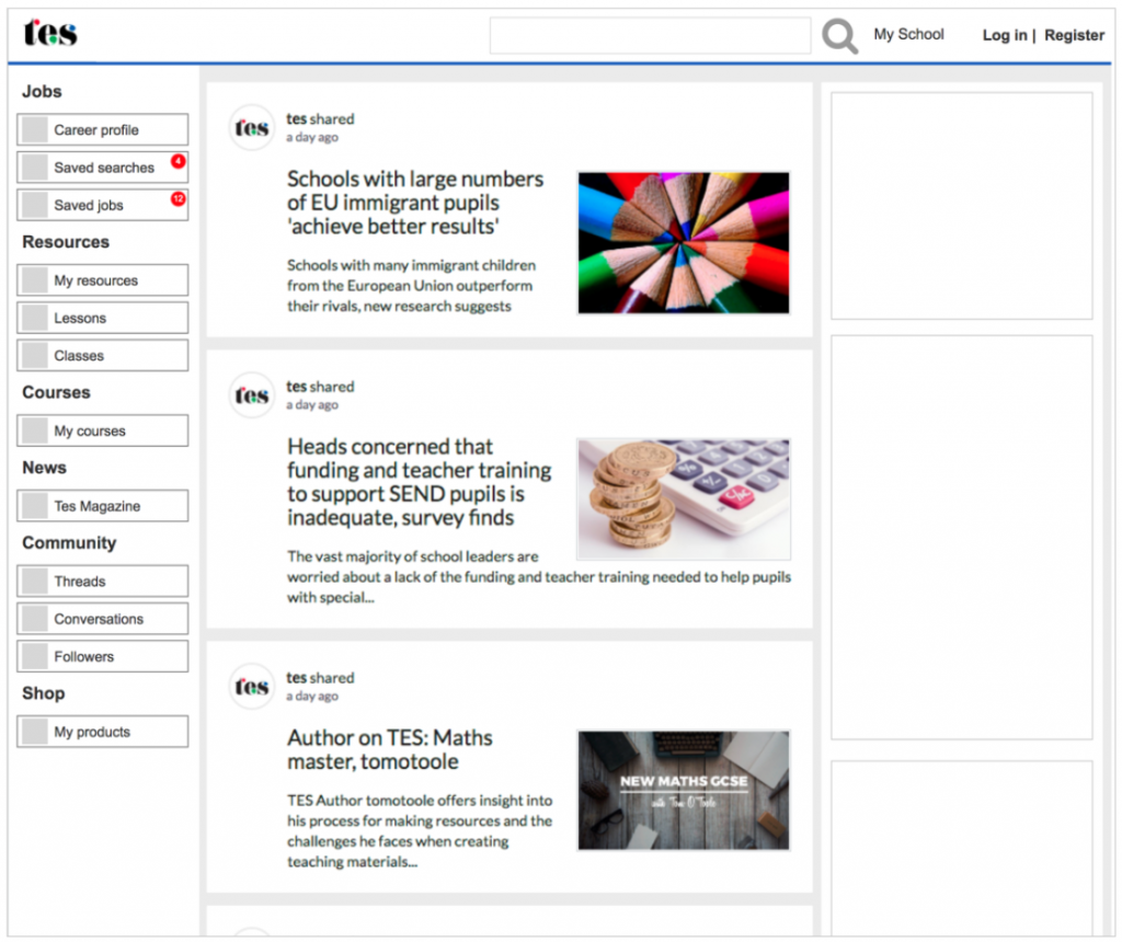
As roadmapped projects progressed over time, the UX team tested the new navigation concepts as part of their product interface designs. These were effectively single blind tests in which we saw some early signs of teachers noticing “tangential” features on the new navigation which were not part of the tasks they had been given.
Socialising the solution
From the inception of the project, I maintained a complete working prototype of the navigation (both desktop and mobile) in order to show stakeholders what we were aiming at.
After iterations over several months based on both research as well as feedback from product roadmap decisions and changing business strategies over time, I presented the design rationale to the teams.
An early wireframe. See also this internal pretension outlining the status of the project at the time
Compromises, failures and mitigation
Large-scale re-organisation of site navigation and IA is rarely straightforward. We came up against both technical problems as well as internal politics. Implementing our ideas was like solving a “Rubik’s cube” that sometimes meant taking steps back to get to the next stage.
For example, the left menu bar had to duplicate the masthead navigation for a lot longer than we wanted to, and also had to be more verbose than we wanted at first.
And everyone wanted their items higher above the fold…
The Rubick’s cube: half way to a better navigation
I approached political issues relating to link visibility and the fold by championing the “new feature onboarding” idea – a UX project in its own right. This was a far more effective way of making people notice high business-value features since it could naturally lend itself to lean experimentation (eg testing the effects of different messaging frequencies, demographics, task matching, etc.)
Another problem was in gathering statistics. Both before the project started, and with the new navigation in place, we were unable to get reliable click metrics on the relevant links themselves. I focused instead on brand recall as our main measure of success, with marketing conducting surveys on this roughly twice yearly.
Some UX takeaways
Is it better not to have navigation?
The most contentious issue that arose from the project was a persistent view that putting more navigation in front of users led to them becoming “distracted” from conversion-critical tasks and key activities.
It was thought the better approach for landing and checkout pages should therefore be to remove navigation entirely (what I term the “Amazon jail”, after Amazon’s practice on the checkout journey).
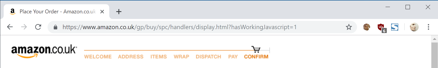
The “Amazon jail” – no navigation away from the checkout page.
But the evidence for overall effects on this was extremely hard to pin down. For my part, I rejected the idea from a UX point of view. Confronting the issue of when to have navigation proved useful in future discussions with the UX and product teams about the design on specific projects.
Visited link styles
It proved difficult to implement visited link styles to help users understand where they had previously been on the site. Despite having a pattern library that specified :visited, the use of CSS overrides in our front end code meant we weren’t able to implement it universally. So I reluctantly decided that rather than have it work inconsistently, it would be better not to have it at all . This prompted me to write some thoughts about pattern libraries in general, and helped initiated a discussion with the engineering team about the way we managed the font-end codebase.
☙
Results and reflections
We were able to apply the new navigation to sections of the site covering approximately 80% of the traffic in just over 18 months. The project is still ongoing, but I had initially estimated the work of applying the new navigation to all of Tes as being approximately three years (a similar project I had worked on for BT.com took over seven years to complete).
In terms of immediate results, we saw unexpected and inconsistent effects on some pages in A/B testing when the new navigation was applied. Some were at first adversely affected on key metrics while others were not. Overall, what statistics we had did not indicate as large an increase in cross-site navigation as we had hoped, but did see an uplift in some areas key areas such as profile editing. But it was too difficult to attribute this defensibly to the new navigation.
However, this increased usage did support an uplift in a brand recall survey conducted six months after we introduce the navigation on some key parts of the site. Not surprisingly we also saw the largest gains where the “new feature onboarding” was used in conjunction with the new navigation.
But the main impact of my work with the teams was to enable them to have both a template and a set of design principles against which to make decisions about navigation on future projects. This meant our design work could be faster and more consistent going forward.