Tes.com Search Interface Redesign, 2018
Improving the interaction design of the search input UI across Tes.com (desktop and mobile web) to provide consistent UX while while constructing an hypothesis to raise conversion.
The challenge
Search was very important for Tes (for example, quantitative tests showed that bounce rates were lower on pages that included search UI). But on a single site containing a number of very diverse searchable entities, establishing user intent across these sections was often a problem:
- Jobs
- Teaching resources
- Training courses
- News & magazine articles
- Tes-endorsed teaching products
- Discussion groups/posts
Users’ expectations varied on how these areas would be searched according to the structure of the data the user’s domain knowledge.
Any redesign needed to allow a sufficiently functional search UI to exist on every page without it becoming unpredictably inconsistent, or dominating the UX of the site.
We also wanted the UI itself to be managed centrally from our pattern library.

Many ways of doing the same thing
In terms of measurement, we also wanted the new design to help raise conversion on key parts of the site (principally jobs and teaching resources) by allowing suitably fine-grained searches to occur without narrowing the field so much that too few matches resulted.
Our current search design suffered from encouraging over-filtering (“filter wilt”) as well as making it hard to know what to filter for.

Filter wilt: after setting the 3rd or 4th filter, conversion dropped to zero.
What we set out to do
Search is one of the hardest areas of UX to get right, and search design requires a clear thought process to identify the problems and the interaction design that might help solve them. It’s also an area that is both helped and hindered by Jakob Nielsen’s observation that all of our users spend most of their time on other people’s sites.
I helped the product team think about specific problems their users faced when finding information in their products’ respective areas, and what the business needs of search were. I wanted search to be seen as an opportunity to enhance the UX of Tes overall, and thereby raise conversion and increase adoption, not simply as hygiene or something to be copied from Amazon.
I framed the issue of “intent” as central to the design of any search system. When a teacher types in “English teaching” are they expecting to find lesson materials, lesson courses, news about the teaching of English, or indeed results relating to just “English” and just “teaching”?
The usage contexts of Tes were too broad to make a global “site search” valuable even if we establish intent (eg via a drop-down categorisation) because that fought with the concept of in-page search that already had in some areas (like jobs and teaching resources). Better instead to provide a unified “search in place” UX, where all our pages have a section-specific search available on them. This would also facilitate better experimentation over time if we only had one search “vector” on the page.
Early concepts and research
Having established an overall concept for the layout and function, and because of the variety of search contexts, I decided to start by researching the interaction design of specific UI elements rather than the design as a whole. We could then look at incrementing the design towards something that would serve as a unified approach across the site.
At the time, the search engineering team was introducing enhancements to functionality such as multiple facet selection and auto-suggest. So I wanted to design the most efficient methods using these to raise conversion.
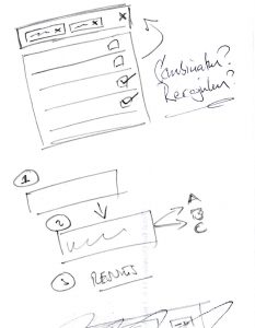
For example, we needed a way of allowing multiple facet selection in a small space. Having no research budget, I corridor tested different approaches by giving people a short task to solve using one of my candidate designs. After testing variations on about about 25 people in this way, I found the most usable candidate.
Armed with my researched information, and in discussion with the relevant product managers about scope and time lines, I took the designs to the search engineering team to get their view on how we might build the solution. After three weeks the result was a “Version 2” iteration (mobile web and desktop) of the former search UI, which we subjected to some weeks of A/B testing on the job search area of the site. Because this version was not my final search design, I was content with the fact that we found the UI did not reduce conversion.
One of the multi-select versions tested (not the final approach).
Dealing with compromises
Search UI is often only as capable as the underlying indexing and other functions of the engine itself. In our case, we found it hard to execute autosuggest in the way we wanted at first. Depending on previous facet selections, suggestions in the UI were not necessarily present in the data being searched. However, we did see some weak correlation between the use of this primitive auto-suggest and successful searches overall, which augured well for a better version.
A UX takeaway
While not in the end a feature of the final version, the multi-select UI we tested against other approaches for Version 2 was surprisingly well understood. I had initially thought it may have been too unfamiliar to people. However, the combination of three familiar patterns (a drop-down menu and a list of checkboxes together with a submit button) was not disorientating for almost all the participants given the task of searching for jobs in more than one subject.
This might be something to bear in mind for future interaction design projects.

Potentially confusing, but shown in research not in fact to be .
☙
The final direction
Having worked with the engineers to understand the technical possibilities, I used our observations from research to create a “Version 3” search that aimed to compact the UI further to the extent that it could be just one input field that used an enhanced auto-suggest to better establish intent.
This version also showed how we might ultimately use the team’s current efforts in building synonym matches and other features.
Demonstrating auto-suggest based solutions.
Demonstrating a possible solution for numeric range searches with synonym matching.
Note that while I did not demonstrate examples of dynamic results generation based on search input, I mentioned it as a possibility to further raise conversion once intent was established (eg by giving prominence to salary data in the results list if salary participated in the input, but replacing this with something else if not).
Given the importance of search to the business, we needed to think through a solution that made sense for our site. Interaction design of this kind produced not only a consistent user interface, but also helped us understand what our users needed from it. In applying design thinking in this way, we achieved both of those goals.