Prototyping the Tes Recruiter Tool 2019
The initial prototyping phase to replace a third-party CRM tool (JobScience) with an in-house solution to replace a loosely-coupled set of systems and procedures that the existing system was incapable of doing by itself. Aiming to decrease KPIs including candidate onboarding, re-booking and billing problem resolution.
The challenge
Revenues from agency teacher recruitment were expected to form a large part of the business over the next two years if we could scale our operations appropriately. This was therefore an extremely important project.
As the sole UX designer for the initial research and prototyping phase, my challenge was to understand the business domain and the teams’ existing workflows. I would then design a unified interface that streamlined agents’ work to extract the maximum benefit from a bespoke system. The execution of this was made easier by the fact that we planned to incorporate data from other parts of the business to realise some efficiencies.
The main activities that needed to be addressed were:
- Acquiring new, and maintaining existing, clients (both teachers and schools)
- “Safeguarding” teachers (background checks and other due diligence)
- Allocation (and substitution) of teachers to jobs
- School billing, charge reconciliation and correction
Our approach
My previous design work relating to permanent teacher recruitment gave me suitable background knowledge about the high-level business needs, market characteristics, and the data and technical capabilities we had. I worked with the product manager (a domain expert himself, having previously been a recruitment consultant) for a week to decide an appropriate course of action and assemble the relevant stakeholders.
My role was then to research the problem space with him and the recruitment teams, and to construct a prototype that would form the basis of the specification for the development team going forward. The project relied heavily on product and UX collaboration.
I was careful to make clear to the PM that we needed to allocate a lot of analysis time to the early stages of the project before making assumptions about design directions. I knew from previous B2B projects that we might find certain activities were happening, but that didn’t mean we needed to reflect those in the new system. We should instead aim to design it such that those activities were no longer necessary.
This meant we had to avoid the temptation simply to build features that the teams said they wanted if we weren’t going to design in inefficiencies by accident. This was very much a case of finding “the problem behind the problem”. We did this by asking “stupid” questions, sometimes multiple times, in multiple ways.
Researching the domain
Our first activity was to construct a journey map, an activity described by James Kalbach in his book “Customer Journey Maps”.
Having conducted numerous journey map sessions in the past, I found them useful during the research phases of complex B2B system design as it helps people think about the detail of the overall processes.
Formal journey mapping was also be a particularly good use of time in this case, since not all the teams worked in the same way. We wanted to discover “alternative flows” and discuss these. This is not always the case in other contexts where front-line stakeholders have a great deal of understanding of roles and activities involved in their team’s work.
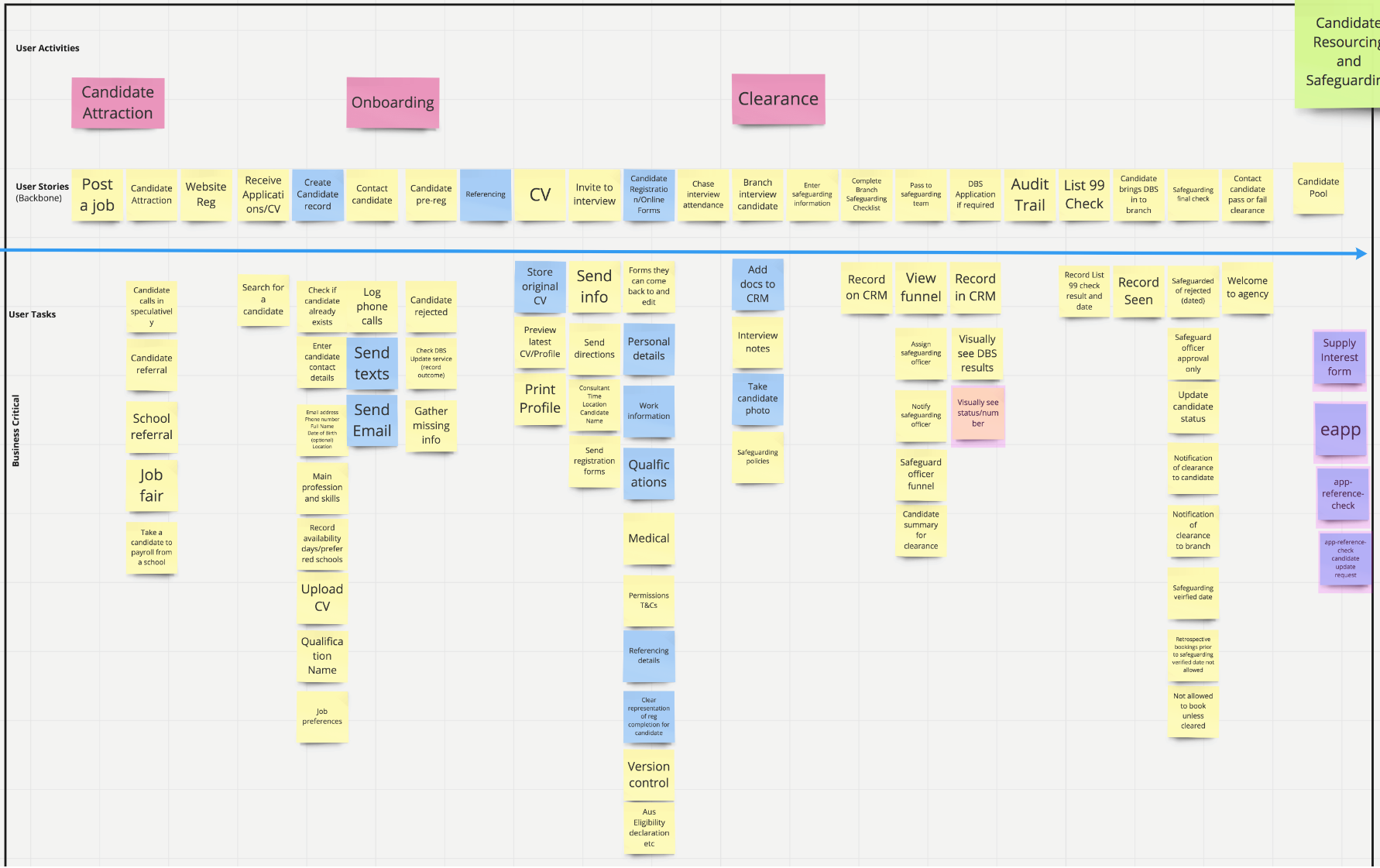
An example of an alignment diagram produced during the journey mapping sessions.
We arranged three days to do journey mapping activities with the teams. This included an introductory session to explain the nature of the project and how we proposed to conduct it. We encouraged them all to have questions about the process and wanted to them to be comfortable with it.
Internal politics is never far away, and in doing this we discovered the dynamic between certain individuals and teams. I again made the point to them that I didn’t want to just take what they told me at face value, but intended to use this as background knowledge to the final designed solutions. It also became clear that informal “corridor” discussions soon became an important part of the research process overall. It was important to make myself and the PM available for these both physically in the office as well as over Slack and email.
Prototyping and testing
Once the journey mapping process was complete, the PM and I digested this with a view to prioritising the initial prototyping phases. The primary deliverable was to be a comprehensive prototype of the entire proposed system (at least for the first build phase), which I constructed using Axure (a partially-completed version can be seen here).
The prototype was then to be used as the basis of the specification for the development teams, with whom we also shared the journey maps, discussing as far as we could general points of technical feasibility early on.
The construction of the prototype was an extremely iterative process, sometimes taking steps back to go forward. We booked 3 to 5 front-line recruitment consultants each Friday to conduct 30-minute remote usability tests over Zoom, recording these for later assessment and note taking.
We treated these sessions much like a B2C project: setting tasks to see if the user could complete them.
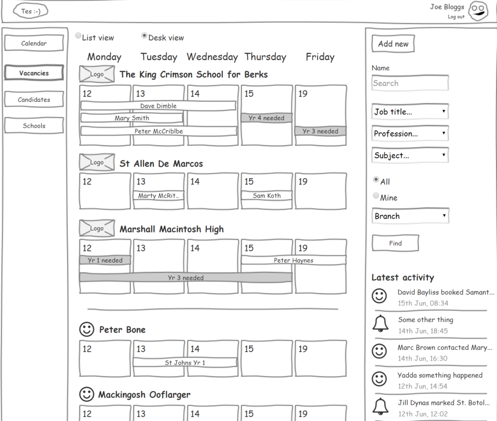
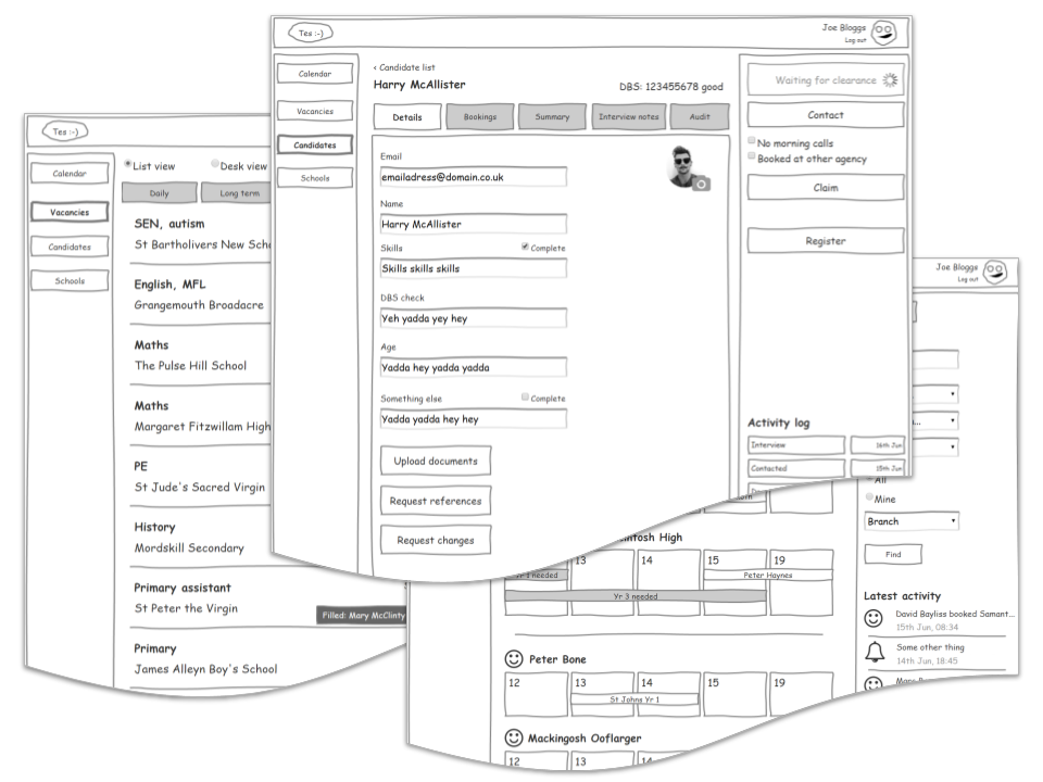
An example of a prototype screen. Note the use of deliberately vague language to encourage questions which might reveal something interesting.
Design rationale
B2B systems traditionally assume that training is necessary to learn how to use the system. In this case, we wanted to make sure the prototype could be used without explanation for at the least the core tasks.
It soon became clear that speed of use (and by extension protection from loss of work) was the primary goal in order to free up time for sales and other communication with teachers and schools. This meant looking for any and all opportunities to have the system perform tasks like interview scheduling and lead prioritisation automatically for the consultant. Since we identified loss of work as the biggest possible UX problem, features such as undo and auto save were demonstrated too.
We also needed to avoid assuming too many workflows. In particular, we need to avoid “modes” of use based on user roles because consultants could approach tasks from many different entry points and moved between roles themselves. The navigation therefore needed to be as open as possible to avoid running complex “rat tracks” in and out of the system.
We also explored the idea of keyboard navigation, but found stakeholders were not initially helped by that.
Identifying problems and solutions
This being a prototyping project, design compromises were minimal beyond a few functions that we knew were only going to be possible in later build phases. I maintained separate “future state” demonstrations of the prototype for that reason.
However, there is always an initially unknown level of acceptance of the status quo (or uncharitably, “salary justification”) in the use of specialist systems. This was particularly true in this case for the consultants’ desire to judge which schools and candidates to choose for sales calls. In the past they had relied on memory, intuition and basic background information. But the new system would have access to data they didn’t have. This offered the possibility of algorithmic evaluation of which leads were suitable at any one time, avoiding wasted effort. Time spent identifying and managing contacts was regarded as a skill that should not be offloaded to the system, so we encountered some resistance.
We conceded that purely algorithmic (or “AI”) based lead selection was always going to be imperfect. So we included features that let consultants override the automatic processes. However, we proposed that outcomes of both automatically and manually selected targets would be measured and reported on using a separate telemetry dashboard available to both consultants and their line managers.
A UX takeaway
Testing a self-consciously “low-fi” user interface with stakeholders came with some drawbacks relating to clarity. For example, we observed some users not seeing functions on the screen that were needed to complete a task. We cautiously interpreted these as being partly due to the lack of visual design (although we found most were probably relating to vocabulary).
But the lack of visual design was deliberate: I was keen to make it obvious to research participants that the prototype was simply a “rough guide”. This I hoped would encourage them to suggest changes while they could see it wasn’t final.
☙
A solid prototype from which to build
Given the size of the whole project to design and build a bespoke system, this was simply a first phase to achieve initial research and prototyping work. Once we were happy with the performance of the model, we turned our attention to the build by engaging the development team. They asked for further information about business logic and supporting information such as field lists and validation criteria. But all other questions were answered by using the prototype that we had developed in testing with stakeholders.
Throughout the project, I kept a visual designer informed of the scope of what we were doing. However, visual designs for what would be a large inventory of individual screens would not be the best use of their time. So we agreed they would provide the engineers a few key screens, then a “library” of designed elements such as search results panels, date selectors and other devices appearing in the prototype. All other elements would be taken from our standard pattern library.
The decision to “buy or build” is understandably difficult. But on the strength of our work on the research and the resulting prototype, the product manager then had the confidence to proceed to investment in the build stage. And doubtless, much iteration and UX learning was to follow.