The Gnome System Menu
Having recently upgraded to Ubuntu Gutsy Gibbon, I see the system menu hasn’t changed. Other than a couple of minor tweaks to the contents, it’s the same as it was in Feisty Fawn.
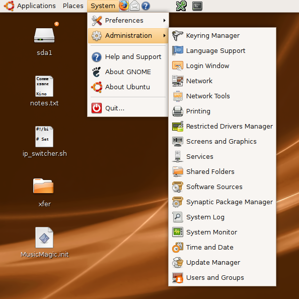
This is pity, because I find I’m often wasting time looking in the wrong menu for things. The system consists of two sub-sections. Here they are in Gutsy: Preferences and Administration. However, I’ve never been able to work out the rationale for what appears in each. This wouldn’t be much of an issue if there were about 20 items overall, but I have about 45 on a reasonably fresh install, and grows over time. Why, for example, is “Hardware Information” in Preferences? How is “Network Proxy” a preference, exactly? Similarly, “Removable Drives and Media” seems like pure administration to me.
Looking at Administration, it seems that most things in there are pretty administrative in there, which makes me think that Gnome would be better splitting the System menu into three sub-sections: Administration, Hardware Settings, and Network Settings. This would scrap the problematic “Preferences” category, since most settings are preferences really, in the same way as most (all?) things are administration. I would also leave some frequently accessed things uncategorised at the top level (Synaptic and Keyring Manager, for example). As we all know, some things just don’t (or shouldn’t be) put in a category.
I’d like to demonstrate that by editing the menu to add those sub-sections, but the UI for this won’t let me. Maybe that’s why there’s this chaos?
Meanwhile, I’m loving the Compiz desktop effects though…!