A Problem With Design Patterns In Practice
Why is it that so far no web application platform, framework or content management “solution” seems to care about the UX of the applications they are responsible for creating?
Systems such as React, node.js, Zend, Drupal, Rails, etc. allow for the debugging of code, the optimisation of resources, ease of configuration and deployment. But they have nothing to offer when it comes to similar issues faced by UX designers who live under their shadow.
Yet with few exceptions, if the products these systems contribute to don’t look good and work well, their long-term survival, and the continuing employment of those who create them, is in danger.
It starts well…
Quite rightly, UX design has been making “pattern libraries”, “style guides” of various kinds, and “design systems” increasingly important artefacts over the last 10 years or so. No serious online system of significant size would want to be without formal attempts to standardise its UI in some way.

While such artefacts may begin life tightly coupled to the reality of the applications they govern, the technologies their patterns rely on have no way of telling designers how, where, or even whether their designed components are being used.
Such libraries therefore gradually become mostly works of fiction. The fiction becomes more and more obvious while the work to re-impose the authority of the style guide on the live system gets harder and harder as new features and functions arrive.
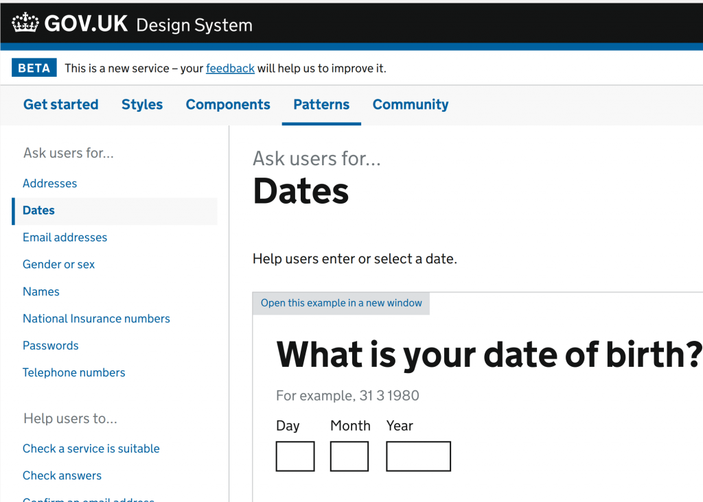
A case in point is I think the recently released design system for gov.uk. This is an impressive and ambitious project. I briefly quizzed the announcer of the system on Twitter about the issue of maintainability over time. I didn’t expect him to say much about it. And indeed, his main response was “It’s hard!” He cited fragmented systems as the main cause. Gov.uk will consequently rely on a “community” to keep things on the straight and narrow. Few sites have the resources or a cooperative public for that though; their UX gradually declining into an eBay and Amazon-like Frankensteinian hell.
So why does it end badly?
I assume this situation is because the architects of the technologies in question don’t understand what the practice of UX entails, let alone the effect of what they are imposing on the designers who rely on them. (The same goes for content too by the way. Why there is an “M” in “CMS” is a completely mystery since no CMS does any “management” of content at all.)
It is not that designers are exactly screaming for help either. Most designers I encounter are keen on design systems and libraries in the abstract, but seem to lose interest in the practicalities of actually making them work in the build and maintenance phase. Perhaps this is because their knowledge of the front-end build process is limited, or they simply accept that whatever the engineers want must be the only way it can happen.
So we’re in a situation where the web is almost 30 years old, yet other than manually checking and re-checking by eye, we have no easy way of maintaining the quality or consistency of the UX of systems people use. Yes, some systems might give you some metadata about a given “module” or “template” in use. But whether that maps to an item in a style guide is another matter.
To what extent is this obvious failure responsible for discontent with the UX of systems in general, I don’t know. But as a UX designer I wish I could look at my style guide and say, “What effect will a change have on the applications this pattern appears in?”, “Should I bother updating this pattern?” or (when looking at the live application) “Is this thing in the style guide?”, or “Since the last release, do we know a given interaction on the site still works?”
Of course, this isn’t the only problem with design systems. But it’s one that I think needs to be addressed if they’re going to become a serious part of design at scale.